
Sunday, 28 June 2015
First image: Leaving for war
I decided to use basic line work for the outline and I didn't include too much detail as the images target audience is children. I then decided to use flat subdued colours as I felt it complemented the line work best. The colours, I feel, represent how it might have been on the actual day that the soldiers left. This is the image that I have came up with, there are some finishing touches that need to be done, but it is almost complete.

Soldiers leaving for war
As I have to draw the soldiers leaving for war I decided to do some research into images that were taken in world war one of the soldiers on the trains leaving to give me an idea of what everything looked like. Here are some images that I found on the internet.
 |
| image taken from: http://www.iwmprints.org.uk/image/743748/ lewis-g-p-soldiers-onboard-a-leave-train-heading- out-from-victoria-station-london-during-the-first-world-war |
 |
| Image taken from: http://urbantoronto.ca/forum/threads/evocative-images-of-lost-toronto.11018/ |
To create my image I will think about all of the different elements of these scenes and put them together to create an image that really tells a story of what is happening.
Sunday, 14 June 2015
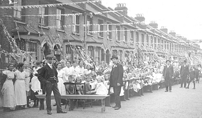
Street party at the end of world war one
Here are a few images that I found on the internet of street parties that happened at the end of World War One. Hopefully this will give me some ideas for my illustration of the street party.
 |
| Image taken from http://gn.northumbria.ac.uk/gn/exhibitions/engage/ |
 |
| Image taken from: http://www.telegraph.co.uk/ news/uknews/royal-wedding/royal-wedding-pictures /8411756/Street-parties-through-the-ages.html |
 |
| Image taken from: http://www.spiked-online.com/newsite/article/10456#.VX2v-FxViko |
Wednesday, 10 June 2015
Summer Project: Heugh Battery Illustrations
I have left university for the summer but I am going to keep using this blog to keep track of research and bits and pieces that I am doing for projects that I am doing. Its just easier for me to have a place to refer back to where everything is kept together rather than seeing something then not being able to find it again. I will also keep track of all my thoughts and ideas so I know whats what. The project that I have going on at the moment to create 6 illustrations for a World War One illustration exhibition at a museum in the Headlands. My friend has a placement at the museum and she has decided to ask me to create some illustrations for an exhibition. I have had 6 basic outlines given to me for the illustrations this is the information that I have been given so far:
- The first one is at the beginning of the war when it was declared everyone had a street party to celebrate so some sort of celebration in the street.
- The second one is when men leave for war on a train.
- Third one is women had to go to work in garages and there was a royal women's Air Force so I was thinking maybe a women stood in front of an old style plane.
- The fourth one is lights out at dark like no street lights or car lights so the bombers can't see the towns or cities.
- Fifth one is of people sitting in an air raid Shelter.
- The last one is the war is declared over so a load of people stood round celebrating again with maybes a person speaking at the front haha.
The exhibition is aimed at children and I have all creative freedom over the style and way that I approach this project. My next step is to research for all of the imagery and create thumbnails. Then I will just go on from there.
Tuesday, 12 May 2015
Evaluation
Evaluation
I began this project with the idea of creating a fun,
contemporary book about artists from throughout history, for the ages of 9 and
up. I wanted to create this product because when I was younger I had no books
based on art that interested me at a young age and the only things that I
learnt about art were from art lessons at school. I decided to stick with the
average children’s book size of 32 pages so that it would fit in alongside
other books on the market.
I decided that so this book would sell, I would have to make
it appeal to the adult market as well as they would be the ones buying it for
their child. For this reason I decided
to go with a contemporary style that would draw a modern parent to it as well
as a younger child. The colours played a large part in making the book appeal
to both audiences, I chose a colour bright enough that a child would want to
pick up but muted enough that it fits in with the latest colour trends, the
colour that I decided to go with in the end was a slightly pastel version of
bright yellow. I feel as though this worked well as it fit in with the black
line drawings used throughout the book.
I wanted to stick with slightly simplistic drawing style
that would appeal to a younger audience, I didn’t want to have the drawings too
simplistic though because I feel as though that would bring the target audience
age down to a much younger age. For the profile drawings I decided to keep them
fully coloured so the reader could get a true sense of what the artist looked
like. I kept the rest of the drawings in black and white because I was inspired
with the old horrible history books as they had a similar style of book to mine
and they worked really well.


For the typography I wanted to keep it very miss matched but
still stuck to a format to keep it looking professional. The reason that I
wanted to keep the text styles mixed is because that seems to be a current
trend within the illustration market and I feel as though this would appeal to
a modern parent. I combined my own hand drawn typography with digital because I
felt like too many hand drawn styles would just end up looking messy. In my
learning agreement I stated that I wanted to improve my hand written typography
skills and I feel like this project has really helped me with that, as I am now
much more confident with drawing letters than I was before.

Although the layouts were quite informal I kept them very
similar for every page, as I wanted to keep a professional feel throughout. I
also added a banner to the top of the page sticking with the muted yellow
colour that I decided on with the name of the book and the page number on. I
did this because I noticed that it was a common thing throughout books on the
current market and I found that it really finished off the pages and brought
them all together as one finished book.
For my last profile I decided that instead of choosing an
artist to write about, that I would leave the profile, information and activity
page for the reader to fill in so they could feel more inspired about art
seeing their own pages amongst other great artists. I feel like getting them
involved will make the book a lot more interesting for them.
When I had completed all of the book I decided to add an extra
bit to my book to make it feel a bit more special so I decided to add a sticker
page to the back of my book. I feel like this adds a bit of extra fun for the
young person reading it. For the stickers I decided to use the profile pictures
of the artist as I felt it would be nice to have them all together in one place,
I also thought that the shape of them was very fun and a bit quirky for a
sticker and this fit right in with the overall style of the book.
Overall I am really happy with how the final product has
turned out. I feel as though I have fulfilled my original intention and it
looks exactly how I had planned in the beginning. I think that my ability to
reach a professional looking standard has improved vastly from previous
projects and this is something that I originally really struggled with. I think
the strongest aspect of this project has been the strong use of hand drawn
typography and the design of the front cover. If I was to re do this project I
think that as well as submitting digitally I would attempt to make the final
product into a proper book rather than just presenting a mock up. One last
thing that I would improve if I was to re do this module is the back cover as I
don’t think the design was as strong as it could have been.


Monday, 11 May 2015
Final Product
As I have completed my front cover design and finished my page layouts I decided to make some mock ups of how the final book would look if it was professionally printed. Here are my mock ups I used photoshop to apply my images to some blank templates. I am very happy with how they look and seeing how they would look if they were printed properly has made me realise that my book would not look out of place on a book shop shelf. My goal for this year has been to progress with my professional finish and i think by looking at these finished products that I have became much closer to achieving that goal.


Final pages: something a bit different
As this book is aimed at a younger audience I decided that instead of having one more artist the last 3 pages could be for the reader to complete their own profile as if they themselves are an artist in the book. I thought this would be a good way to get the reader involved and excited about art.
I will include a little frame where the reader can draw a mini portrait of themselves, and a space for them to write their name. I will also include some sun headings below the name such as date of birth, where you live and hobbies that you have. Below the profile I will have a drawing of the gallery guide and a blank section for the reader to write a bit about themselves. The next page will be for the reader to write some facts about themselves and draw some doodles to match the facts. The last page will be an activity page, this is going to be where the reader can create their own piece of art.
I think this idea will be successful amongst the target audience as it is a fun little activity for them to get involved in at the end. Its a bit like a little added surprise for them at the end of the book. I also feel like this might inspire the reader a bit more as they will feel like they are in the book alongside some of the most famous artists from history.


Subscribe to:
Comments (Atom)