
Showing posts with label Cd cover. Show all posts
Showing posts with label Cd cover. Show all posts
Wednesday, 29 October 2014
CD Font
I decided that for my CD case i wanted to have a hand written scrawly font. I experimented with trying out a few different writing styles but i didn't really like them that much. After giving it a thought I decided to try out writing the album name without taking the pen off the page and I really liked how it turned out so I decided to stick with this hand written style of font.
Final album cover design experimentation
I have decided on the final design of my album cover. I decided to change my mind slightly from the original sketches because when i started to assemble the final image it looked like the Fred Perry logo and it didn't look dark enough to fit Agnes Obels style of music. I decided, after doing some artist research, that to change the mood I had to darken the colours to more dark red, brown and orange tones and change the composition slightly to make it look a bit more sinister. I also added some shadows to make the image a but more moody. and I removed the tail from the woman as I was struggling with it compositionally and colour wise. Here is my new basic design, I will keep experimenting with it a bit longer and will also experiment with text placement. Also I would like to note that the final image will look slightly different as it will hopefully be printed on brown recycled card.

After finishing the final design i decided to experiment with the image to see what it would look like with a bit more going on. I created a few different marks and shapes and scanned them in to layer into the image. After doing this I decided that it worked better with the original design because it looked a bit too messy with all of the other things going on in the image. I also tried out the image using only one of the textures that I created but didn't really like that either.


Tuesday, 23 September 2014
Illustrated album cover research
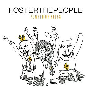
I came across an illustrated album cover for foster the peoples album and when I researched into it, it seems that the same illustrators (young & sick illustration) do a lot if not all of their art work I think the bold black line work works really well against the bright white background. The yellow pop of colour that a lot of their album art features also makes the image really visually interesting. This is not the style of illustration that i'd like to do for my album cover, but the central composition that they seem to use a lot is something that I would like to do with my album cover.
I think their more recent covers apply a bit more to my work as they use more colours and prettier imagery rather then simplistic line drawings they are more detailed and have a more interesting look to them.


I think their more recent covers apply a bit more to my work as they use more colours and prettier imagery rather then simplistic line drawings they are more detailed and have a more interesting look to them.
Subscribe to:
Posts (Atom)