Showing posts with label Non-Narrative. Show all posts
Showing posts with label Non-Narrative. Show all posts
Wednesday, 5 November 2014
Overiding concept
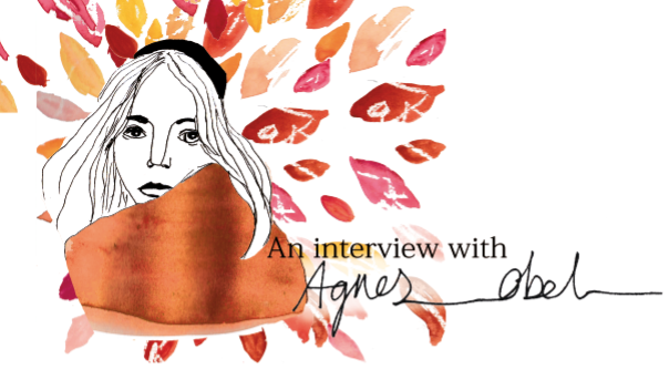
The overriding concept of my work is Scandinavian folk tales and in particular tale of Huldra. I also focussed on the idea of the dark undertone of an enchanted forrest in autumn as this is what the sound of Agnes Obels album made me think of. I decided to not base my concept off the lyrics in her music and more on the artists influences, herrotage and the sound of her music. I did this because in an interview Obel stated that she likes the musicality of her music rather that the lyrical side of it. I looked at the influences and traditions of Scandinavian art and design to help me shape and refine my project.
Conclusion
In conclusion, when I first found out the subject of the
brief I was worried because I couldn’t imagine my illustrations complying with
many music styles but after considering all of the music choices from the list
of options I began to see how my illustrations could work. Agnes Obel in
particular stood out for me because of her calming but dark sound and her
Scandinavian background. I decided to look into the stories of Scandinavian
folk tales as Obel stated that they inspire her music. After reading a few of
these tales one in particular, the story of Huldra, made me think of really
strong imagery of a woman hiding in an enchanted forest with leaves protecting
her . To fit in with this concept I decided to look at Scandinavian artists to
get inspiration for my colour palettes. I began to find it hard with such a
drastic change in colour use, as I had never attempted anything like this
before plus at this point I was finding it difficult to work with the imagery
that I was creating as it was a bit to light and happy to fit in with Agnes
Obels music style. At this point I had to re evaluate what I was doing and go
back and do more artist research into Scandinavian artists and illustrators
that create darker work and that use colour palettes that I can relate to more.
This helped me out a lot with my final image and after this research I had a clear
idea and vision of the final image and the colours and I felt a lot more
confident in what I was creating.
Overall I am really pleased with the final outcome of this module
because I feel as though I created a well-rounded body of work that is finished
to a high standard. I am very proud of the finish of my work because that is
usually the area that I struggle with most but throughout this module I was a
lot more prepared and determined to get a more professional finish to my work
and it’s the first time that I feel like I have been able to present work that
I am really proud of. If I was to complete
this module again I would have thought about the target audience a lot more in
the beginning then I would have avoided having to re think my idea half way
through and it would have saved a lot of time, although I am glad, in a way
that this happened because it really helped me to push my ideas further to
create a stronger image. I think that I would
have also done a lot more artist research to help me to refine my ideas further.
Evaluation
Once I had chosen the album that I was going to base my
project on (Aventine by Agnes Obel) it was time to think of a concept that was
fit for the purpose, to help me narrow down and refine my ideas. I feel that
the concept that I chose was fitting for the album choice because of the
artist’s influences and heritage, it helped me a lot with thinking of an idea
for the album cover. The concept gave me
a point of reference that I could always go back to if I got stuck with what
image I wanted to create.
I then moved onto artist research, this helped me greatly
because it helped me realise what I am capable of stylistically and helped me
to understand how I work. Throughout this project I realised that I am not much
of a graphical illustrator like most Scandinavian artists, because of this I
looked at a broader range of artists so that my influences would work for my
style and me.
After researching a large range of subjects surrounding the
album I decided to go ahead and start creating my images. This is the point
where I realised that I would find the colours of Scandinavian art hard to work
with, I also noticed that the art I was creating [fig.1&2] looked to innocent and happy
to fit in with the themes of Agnes Obels slightly dark album. This forced me to
take a few days to stop and re evaluate what I was doing and I’m so glad I did
that because I came out with much
stronger art work in the end. The colours that I decided to use in the end
reflect the autumnal feel of an enchanted forrest. I feel as though the deep
reds and oranges [fig.3] help to darken the image a lot fitting the album a lot more, the same stands for my poster design. I used water colour and digital art to complete the piece, this is different to most scandinavian art but it is a medium that i am more confident in using so i am pleased that i stuck with my instinct because the piece came out really nice.
For the product that I decided to screen print the material,
this allowed me to learn and try out new techniques. I am really happy that I
used this technique because I think the final outcome of my product works
really well. I found the process of screen-printing hand and complicated
because my memory was really tested with trying to get all of the correct and I
made a few mistakes a long the way but overall I enjoyed the process.
I feel as though i completed the editorial piece [fig 4] in a very fitting style and it fit in with the editorial research that i did. I was pleased with the outcome of the editorial because i had never really tried out this style before but i really enjoyed it and it came out exactly how i imagined it in my head.
The positives of this project for me were how I presented my
final body of work because I feel it is the most professionally presented
project that I have ever done. The presentation is usually where I fall down
and that greatly effects the overall project, this time is the first time I
have been proud to present my work. I also think that I have managed to do
branding well throughout this project as all of the items I have created are
cohesive with each other and look like they are part of the same family.
In the future I feel as though I could be more thorough with
artist research because although I feel like the research that I did helped me
out a lot, if I had completed more of it, I could have refined my ideas and
style a lot more. I could have also created work that was more linked to the
style of artist that I was looking at. I could have also improved my analysis
of the album cover in the beginning and that would have saved me having to re
evaluate my ideas half way through therefore saving me time overall.
Overall I am pleased with my work but areas of my research
and development could have been improved. I feel as though I have improved greatly
compared to previous projects but there is still room for further improvement.
 |
| Fig 1 |
 |
| fig 2 |
 |
| fig 3 |
 |
| fig 4 |
Tuesday, 4 November 2014
Final product photos
I have already done a post on the making of my product but I thought I would take some nice photos of my product in a way that I would present them if I was going to sell it on a site like Etsy. I wanted to take unique photos rather than run of the mill photos so this is what I have came up with (with the help of Zade)


Final editorial
I decided for my editorial that I would go with the second design that I created because it was a lot more clean looking, I also thought it worked better because the drawing of Agnes Obel was facing forward rather than away from the page so it looked like it would work a lot better for a magazine editorial. I had to change the composition of the design slightly to fit the briefs specifications so this is my final design ready for submission.

I am so pleased with how it turned out, I surprised myself slightly because I didn't think I could really pull something off that would work well for an editorial but I did and i really enjoyed creating this image and experimenting with this style.
Final CD cover
After completing the artwork for the CD I scanned it in and put it into a template on photoshop then printed it out onto an A3 sheet of card. It took a while to print because I had to use the by pass tray but once it was printed I was really happy with the results because the colours printed out so vibrant and exactly how I wanted it to look. I am so glad that I was able to print onto this kind of card as it was my intention from the beginning and for a while I wasn't sure if it was going to be possible but I think that the card case really finishes the overall look of the album cover. Here are some images that I took of the completed case.
 |
| Front cover |
 |
| centre of cd case |
 |
| Back of CD case |
Sunday, 2 November 2014
Making my product
The first thing that I had to do to create my product for this project was screen print my leaf design onto the plain cotton material that I bought, once I had done that I was ready to begin making my cushion. Here are all of the materials that I used including the material that I screen printed.

First I cut out all of my material (the back, the front and the wadding for the centre) into leaf shapes ready to sow together. Before I started sowing the cushion up though I pinned the wadding to the back of the printed material and sowed around the veins of the leaf to add a more textured quilted effect.
.JPG)
.JPG)
After completing the quilting I sowed everything together including the pom pom fringing around the edge. At this point it was important for me to sow it up inside out to hide all of the seams to create a neat finish. I also had to leave a small gap so I could add the stuffing. Here is the cushion all sown up and inside out.
.JPG)
The final few steps were to turn the cover back the correct way stuff it and sow up the open gap. Here is the completed cushion before and after stuffing it.
.JPG)

Overall I am really pleased with how the cushion turned out because it looks really neat and unique, I also like the fact that the product is functional. I think that I would like to create material and make it into things in the future because I really making enjoyed this. I am not that good at screen printing and dread the thought of it a bit, but other than that I would definitely do something like this again.
The final few steps were to turn the cover back the correct way stuff it and sow up the open gap. Here is the completed cushion before and after stuffing it.
Overall I am really pleased with how the cushion turned out because it looks really neat and unique, I also like the fact that the product is functional. I think that I would like to create material and make it into things in the future because I really making enjoyed this. I am not that good at screen printing and dread the thought of it a bit, but other than that I would definitely do something like this again.
Editorial part 2
After creating my first editorial image I wanted to utilise the other image that I drew of Agnes Obel so I decided to see how I could push myself to create an even stronger image. I wanted to keep the same style of the first editorial piece that I made but change the image and colours that I used. First of all I scanned in the image that I had previously drawn and then cleaned it up on photoshop using the levels.

 I then added some colour into the scarf, this time I decided to neaten the edges up and change the colour to a more burnt orange.


I then added text to the image, I used the same text as the previous image that I made because I think it worked really well and complemented the image.
Im not sure if it needs it or not because i quite like the image how it is already but I decided to tryout adding the leaves from the album cover to see how it looked.
Im not 100% sure yet but I think that I prefer this image for my editorial piece, I am going to give it some thought before I decide on my final image as I want to be completely sure on my decision.
Editorial part 1
After doing some research into Editorial artwork, I decided that I liked the look of using line work for the whole image with splashes of colour as I feel like it makes an image look really interesting. I started off by drawing a few pictures of Agnes Obel, as I couldn't draw from life I had to draw from already existing photographs from the internet. I decided to go with a stylised drawing as realistic drawing isn't my strongest point. I then added fine liner over the top of the drawings to make a more bold definite outline. Then I scanned in the drawings that I had done, I originally did 2 drawings so I could decide which one I liked best after playing around with them on photoshop. Here are the first drawn images before I scanned them in, for some reason I really messed up the right eye in the first drawing and didn't realise for ages but I drew a new one and fixed it together when I had scanned it all into photoshop.
.JPG)

I then fixed the eye and changed the levels to make the image look more crisp.

Then for the colour i decided to paint a rough rectangle of watercolour to be scanned in and used as my splash of colour, I decided the colour would work really well when used in the scarf as that is a very bold part of the image. I decided to leave the edges of the paint exposed as I think it adds an extra edgy look to the image.
 I Then decided that the image looked a bit boring and i wanted to have something happening in the background of the image, so to tie the editorial in with the Album cover that I designed I decided to use the leaves from that to create a pattern behind her head.
 I finally added some text because if it was in a magazine there would be a title for the article and I wanted to keep the same font that I used for the album cover because I feel as though it fit in really well with this style of drawing.

Overall I am really happy with how this turned out as it looks like I imagined it. Although I am pleased with this image, I am still going to make another image from the other drawing that I did of Agnes Obel, so i can decide which editorial image that I like best.
Then for the colour i decided to paint a rough rectangle of watercolour to be scanned in and used as my splash of colour, I decided the colour would work really well when used in the scarf as that is a very bold part of the image. I decided to leave the edges of the paint exposed as I think it adds an extra edgy look to the image.
Overall I am really happy with how this turned out as it looks like I imagined it. Although I am pleased with this image, I am still going to make another image from the other drawing that I did of Agnes Obel, so i can decide which editorial image that I like best.
Saturday, 1 November 2014
Frankie magazine
Frankie magazine is an aesthetically beautiful bi monthly magazine based in Australia. It is known for being incredibly feminine and pretty, The magazine covers lots of different artistic topics such as photography, art, interior design and even real life stories.


The magazine always includes lovely girly illustrations from all different illustrators throughout the world, the illustrations in the magazines vary in style but often have a slightly similar look and feel to them probably due to the delicate pastel, feminine colours and line work that are used a lot. I love this look I think it works so well as the drawings fit in really nicely with everything else in the magazine. I don't think that this magazine has had an issue with an illustration that i don't like. Because of this, I hope to create an editorial piece that wouldn't look out of place within this magazine. Here are a few illustrations that i think work really well.
Editorial Artist research Sarah Hingle
After giving my editorial piece some thought I realised that it would be good to try and include a drawing of Agnes Obel herself as the article will be about her. I decided to look into an editorial illustrator that draws portraits for magazines. Sarah Hingle is an Australian illustrator that has worked for magazines from around the world including Elle magazine, Frankie magazine and milk and honey to name a few. Her style is very traditional looking as she draws very accurate portraits using pencil, a lot of her drawings are also brightened up with splashes of colour in the backgrounds. I think her drawings work really well because they are very delicate and pretty whilst remaining lifelike the colour she uses adds an extra element of interest and excitement, which I hope to achieve within my editorial piece. I am going to tryout drawing Agnes Obel in pencil and add colour for more interest and see how it works out. I don't know if ill be able to pull off drawing as realistically as Sarah Hingle does but ill give it a try and if it doesn't work out I can always simplify my drawing to suit me more.


Thursday, 30 October 2014
Poster Design
For my poster I wanted to create something a bit different from the album cover but using the same colours and theme of an enchanted forrest. I decided to expand on the cd case and instead of having leaves on it I wanted to create the whole forest. I did this by painting various tree shapes using the same colours that i used for the leaves on my cd case. I then added lots of different black tree trunks, I wanted to make the bottom part of the forrest quite dense with tree trunks to add more mood and to darken the image slightly. Next I added a dark background that I created with watercolour and the hand written text. The final thing that I wanted to do to add more interest to the poster is add a light glare coming from the forest trees, I feel like this adds to the story of the CD case because it looks like the scene from the CD is happening in the forest where the light is coming from. Overall I am pleased with how the poster turned out because I feel like it sets the right tone for the album.
The next step is to print out the poster design onto A2 paper that has a grey sort of colour to it. I decided on this colour because I didn't want to use a paper as dark as the cd case because I feel like it would make the image too dark, but I didn't want to use a bright white paper either so this is a good middle ground.

The next step is to print out the poster design onto A2 paper that has a grey sort of colour to it. I decided on this colour because I didn't want to use a paper as dark as the cd case because I feel like it would make the image too dark, but I didn't want to use a bright white paper either so this is a good middle ground.
Wednesday, 29 October 2014
Song list
I decided to have a scrawly hand written font for my CD case to fit in with the recycled home made feel that I want it to have, I stuck with this style for the song list. I hand wrote all of the song names with a unique style of keeping the pen on the page to create a really nice style of type. I then scanned in the text and darkened it. I decided to add the leaf detail from the front of the cd case around the edge of the songs to make it look more interesting. I really like how this turned out because I think the text fits in really well with the overall style.

CD Font
I decided that for my CD case i wanted to have a hand written scrawly font. I experimented with trying out a few different writing styles but i didn't really like them that much. After giving it a thought I decided to try out writing the album name without taking the pen off the page and I really liked how it turned out so I decided to stick with this hand written style of font.

Print tests
I printed out some tests using the same card that I plan on printing my final CD case on. I came across a few problems when printing out my album cover design so i'm not sure if ill stick with my original idea of printing it onto recycled card. I printed out a few different designs to see how that would look, The edges of the design all turned out quite well but the centre didn't work out at all and it looked really washed out and barely visible. I will now have to figure out what to do I think I might try using a more grey card rather than brown to see how that works out.

Final album cover design experimentation
I have decided on the final design of my album cover. I decided to change my mind slightly from the original sketches because when i started to assemble the final image it looked like the Fred Perry logo and it didn't look dark enough to fit Agnes Obels style of music. I decided, after doing some artist research, that to change the mood I had to darken the colours to more dark red, brown and orange tones and change the composition slightly to make it look a bit more sinister. I also added some shadows to make the image a but more moody. and I removed the tail from the woman as I was struggling with it compositionally and colour wise. Here is my new basic design, I will keep experimenting with it a bit longer and will also experiment with text placement. Also I would like to note that the final image will look slightly different as it will hopefully be printed on brown recycled card.

After finishing the final design i decided to experiment with the image to see what it would look like with a bit more going on. I created a few different marks and shapes and scanned them in to layer into the image. After doing this I decided that it worked better with the original design because it looked a bit too messy with all of the other things going on in the image. I also tried out the image using only one of the textures that I created but didn't really like that either.


Artist research Sandra Dieckmann
Sandra Dieckmann is an illustrator From Germany she creates beautiful artwork using what looks like pencil and watercolour. Her images often revolve around nature and wildlife but they always have an extra magical touch to them.
I decided to research into this artist in particular because I was strugling with making my image more dark and this illustrator likes to show the darkness in folktales which is what i am aiming to do with this project.
"The best folktales have a dark edge. Conversely, the best folk art pops with colour - perhaps as a visual way of whistling in the dark, perhaps a celebration of the richness of northern Europe's storytelling tradition. Sandra Dieckmann's nature inspired illustration has got that elusive, comfortable yet disquieting quality in spades."(Digital Artist Magazine)
The thing that I think works best within her work is the delicate lines, colours and patterns that she uses. I also really like the compositions used within her work, I feel like they are really considered and really add to the mood of the image. I will look at the compositions and colours of her work and try and improve the mood in my own work.
Subscribe to:
Posts (Atom)