Showing posts with label drawing. Show all posts

Monday, 2 March 2015

Van Gogh's Starry Night Development

I wanted to include some of the artists work and to be able to do this I will have to create my own versions of the artists paintings. As I am including a fact about the Starry Night painting by Vincent Van Gogh I thought it would be fitting to start off with that. I started off by looking at his painting and mapping out where all of the main lines are. I did this in black to follow the format of all of the other drawings in the book. 

When I was happy with that I decided to add hints of colour underneath. I started off with yellow as that was one of the more predominant colours within his original painting. I chose a shade that I liked, I decided to choose a more contemporary mustard yellow to add to the modern feel of the book. 

I finally added some blue strokes to finish off the painting. I wanted to keep it very loose and modern to give it a bit of a twist and make it feel more fitting with the rest of the book. Again I chose a more subdued shade of blue to complement the yellow. I also added a little bit of dark blue to darken up some areas of the image. 


Overall I am happy with how this image turned out and I think it will go nicely with the rest of the images in the book. 


Monday, 16 February 2015

Frida Kahlo initial drawings

I want to draw all of the artists in the same style line drawings. I will then colour them digitally. Here are the original drawings that I did of Frida Kahlo. I think that the first and last drawing  work well but I'm not too keen on the second drawing, I think that the face shape is too round because of how I have drawn the jaw line. I do like the head dress on the second drawing so I might end up combining it with the first drawing. As these are just initial sketches the final image might change slightly from what goes into the book. The next step is to clean the final drawing up on photoshop and colour it digitally.


Sunday, 2 November 2014

Editorial part 1

After doing some research into Editorial artwork, I decided that I liked the look of using line work for the whole image with splashes of colour as I feel like it makes an image look really interesting. I started off by drawing a few pictures of Agnes Obel, as I couldn't draw from life I had to draw from already existing photographs from the internet. I decided to go with a stylised drawing as realistic drawing isn't my strongest point. I then added fine liner over the top of the drawings to make a more bold definite outline. Then I scanned in the drawings that I had done, I originally did 2 drawings so I could decide which one I liked best after playing around with them on photoshop.  Here are the first drawn images before I scanned them in, for some reason I really messed up the right eye in the first drawing and didn't realise for ages but I drew a new one and fixed it together when I had scanned it all into photoshop.


I then fixed the eye and changed the levels to make the image look more crisp.

Then for the colour i decided to paint a rough rectangle of watercolour to be scanned in and used as my splash of colour, I decided the colour would work really well when used in the scarf as that is a very bold part of the image. I decided to leave the edges of the paint exposed as I think it adds an extra edgy look to the image. 
I Then decided that the image looked a bit boring and i wanted to have something happening in the background of the image, so to tie the editorial in with the Album cover that I designed I decided to use the leaves from that to create a pattern behind her head. 

I finally added some text because if it was in a magazine there would be a title for the article and I wanted to keep the same font that I used for the album cover because I feel as though it fit in really well with this style of drawing.  


Overall I am really happy with how this turned out as it looks like I imagined it. Although I am pleased with this image, I am still going to make another image from the other drawing that I did of Agnes Obel, so i can decide which editorial image that I like best. 


Wednesday, 9 April 2014

Drawing on the Right Side of the Brain, Betty Edwards

As it is eater and i have 2 weeks off, as well as getting on with my university work i have started reading through, and doing the drawing exercises set in the book Drawing on the Right Side of the Brain, by Betty Edwards. Hopefully this will help with my drawing skills and make it easier for me to just draw what i see. It is really good so far and i am learning a lot about the brain and how it works in relation to drawing and seeing. just thought id put this on my blog for anyone that maybe wants to learn or improve their drawing skills. The before and after pictures incredibly different i don't know if i believe them or not but i guess we will know by the time i finish the book. Here are some of the before and after drawings from the book. 


Friday, 28 March 2014

Creepy looking Self Portrait (messing around)

As we have to create a self portrait for a class zine i decided to draw my face with quite a loose style. I wanted to keep it kind of realistic i thought this would be a good place to start just to get to know how to draw my face before trying out any particular style. I think it worked out although the way i have done the shadows makes me look like i have whiskers (oopsy). Also my lips look strange because i was pulling a weird face in the original image that i was drawing from. I think that i like the idea of me pulling a strange face in the final image. 


 Overall i'm not crazy about this image but its only a rough starting point so i'm okay with that. Im  not sure how i am going to do my final self portrait but i will keep drawing myself in different ways then ill decide what i like best. 

Saturday, 11 January 2014

Digital manipulation Fourth and fifth images

For my final two images in the digital manipulation module i decided to stick with the same technique as the first two collage style images that i had perviously created. I decided that they would work well as a set, i used the same techniques to create them starting with a quick sketch and building the image up in photoshop with colours and textures. I used quite restricted colour pallets on these two images and i think it works and sets the mood of the day as it was a dark and dreary day. Although the colours for these images worked i think if i was to create these images again i would probably change them as i think there is too much brown being used. Overall i am satisfied with how the images turned out. Below are my final two images 


Tuesday, 26 November 2013

Artist research: Neesha Hudson

I was searching for illustrators on pintrest i came across an illustrator called Neesha Hudson. The soft pretty colours is what first attracted me to her illustrations. She outlines in pencil or coloured pencil then uses ink washes and water colours for a lot of her illustrations. I like the washed out pastel colours 


Tuesday, 12 November 2013

Artist research: Onasup

Onasup is a digital illustrator and graphic designer from South Korea He creates these bright eye catching images. I love all of the colours and shapes that he uses to create the pictures. The thing i like most about his images is how the animals have so much character in their faces yet they are still abstract. Below are some of my favourite pieces of his. 


Digital manipulation: Second image

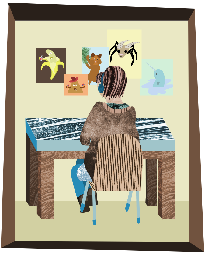
For my second digital image i decided to develop my first image and experiment with using textures and colours. I decided to execute the piece in a collage style as i thought it would work best for the look i wanted to achieve. I started off using the same image as my first piece as a guide. 


I first drew out the hair and headphones using the pen tool. once it had made a selection i took a texture that i had made earlier in the print room and pasted it into the selection, making a layer mask. I then edited the colour to make it fit the blue and brown colour scheme that i wanted to use. 

I liked how it was beginning to look so i used the same technique for the face and neck jumper and chair. 


To break up all of the textures i created the legs, feet and the legs of the chair using block colour. I decided to go with blue for the legs and brown for the feet. I created them the same way as the rest of the image, using the pen tool. 
I then added in the table and the background of the wall and floor to add a bit of depth to the image. I decided ot break the colour scheme for the wall and floor to draw more attention to the main focus of the image.
I had to put some posters on the wall infront of the girl so i made some silly little posters with funny characters on them. I decided to break away from the colour scheme on these images as well as i thought it would look better. 

Finally i decided to add a frame to the piece to finish it off. I decided that this would bring the image together more. 
Below is my second final image. 


I am really happy with how theis image turned out. I think if i was going to improve it the only thing that i would do differently is use less textures as it looks a bit texture heavy. Other than that i am happy with the piece.


Digital manipulation: First image

I started off my digital manipulation project by scanning in an image that i had already sketched to use as a template. I decided to use this drawing of Emma sat at her desk because i liked the composition of it and I thought that it would look good if I improved it. I used my original drawing as a guide so i started off with the rough sketch.


I then began digitally drawing in the head and earphones using the wacom tablet. I decided to go with an all grey colour scheme as i had never really done this before and i wanted to try it out.  In the  pictures below i turned the guide image off so the lines are clearer to see.


I then continued to draw the body and chair  using different shades of grey.


I then drew in the table and blocked in the posters in the background. to create the shapes of the posters i used the square tool to create a perfect square i then just painted the squares the colours that i wanted them. 
Below is my first final image.

I am happy with how the image turned out but i think that it is a bit boring so for my next image i think i will develop this image using more colours and textures. 


Monday, 30 September 2013

September 30th: Reportage

Today I went out on a few different locations and did some reportage drawing. Here are a few of my favourite sketches

 I drew the view from outside of the window first. I experimented with using dots of ink for the leaves, I really like how it turned out because although it is one block colour the tree still looks like it has depth.


After university I went for a coffee in town. I didn't have my sketch book or a pen so I took some napkins and borrowed a pen from the man behind the counter. I decided to draw the tables and chairs outside then drew some from inside. The drawings aren't the best because i found it quite hard to draw on tissue paper. I still like these drawings though, I think they tell more of a story than the other drawings in my sketchbook. 


Later on that night I went shopping in Asda and decided to draw as I was walking around. I just used biro pen in my sketch book. I actually like how it looks because I think it shows the fast movement that is often found in a supermarket.


September 30th: Life drawing

Today we had a nude model come in and pose for a life drawing session. I used a lot of different techniques, for example I used my left hand for a few drawings and didn't look at the page for some.i also tried not taking my pen off the page and covering one eye to draw. I really enjoyed doing these things because it made it a lot more interesting and fun rather than just sitting and drawing. I really enjoyed the session below are some of the drawings that I created from it.


Two colour 

Woman's body with someone else's head (Dans) 

Continuous line drawing 

Not looking at the page 

30 second sketches 

Half drawn with left hand half drawn with right hand 

29 th September: Drive to Hinderwell

Yesterday I went on a drive to see my aunty in Hinderwell (near Whitby.) The drive is really pretty and scenic I took advantage of this and did a few quick sketches of the passing countryside and roads. When I returned home I worked into a few of the sketches and added colour, I experimented with water colour and coloured pencils. I like the look of water colour more than I like the coloured pencil because it looks a lot more natural. I also decided to take the image that I drew of the inside of the car and use cooking oil to make the window transparent so the road drawing from the next page would show through. I think this worked really well. 


Friday, 27 September 2013

25th September: Drawing at Hartlepool Marina

i went over to the marina to do some drawing but the weather was wet and cold. I ended up mainly sitting in the cafe. I did a few drawings of the inside of the cafe, i also did a drawing of some boats outside. I think ill re-visit the marina on a better day to do some proper drawings. I used a few different things on these drawings mainly pencil and felt tip pens. sorry about the images a few of them have gone upside down and side ways and i have no idea why or how to fix it :/