Showing posts with label digital manipulation. Show all posts

Saturday, 11 January 2014

Digital manipulation Fourth and fifth images

For my final two images in the digital manipulation module i decided to stick with the same technique as the first two collage style images that i had perviously created. I decided that they would work well as a set, i used the same techniques to create them starting with a quick sketch and building the image up in photoshop with colours and textures. I used quite restricted colour pallets on these two images and i think it works and sets the mood of the day as it was a dark and dreary day. Although the colours for these images worked i think if i was to create these images again i would probably change them as i think there is too much brown being used. Overall i am satisfied with how the images turned out. Below are my final two images 


Wednesday, 20 November 2013

Digital manipulation: third image

For my third image i decided to keep with the style of my second image. I started off with a sketch of a woman that i did in a cafe.


I then added in the dividing wall and lamp to the fore ground. I did this using the pen tool and filling the selections with textures and colours. 


I used the same technique for the rest of the image so it didn't look to miss-matched. The final image is below.  


Wednesday, 13 November 2013

Artist research: Dominicadesign (minky-munky)

I found this artist whilst searching on deviant art for digital artists. She uses vectors in illustrator a lot, i know we are using Photoshop at the moment but as my pieces use the pen tool a lot, which is similar to illustrator, i thought that this artist was relevant for me to look at. I love the simplicity of her work because it is simple but so bold and effective. I also really like the colour palettes that she uses. Below are some of my favorite images from this artist.  


Tuesday, 12 November 2013

Artist research: Onasup

Onasup is a digital illustrator and graphic designer from South Korea He creates these bright eye catching images. I love all of the colours and shapes that he uses to create the pictures. The thing i like most about his images is how the animals have so much character in their faces yet they are still abstract. Below are some of my favourite pieces of his. 


Digital manipulation: Second image

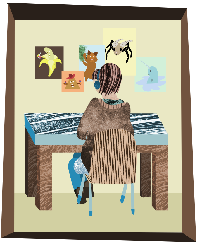
For my second digital image i decided to develop my first image and experiment with using textures and colours. I decided to execute the piece in a collage style as i thought it would work best for the look i wanted to achieve. I started off using the same image as my first piece as a guide. 


I first drew out the hair and headphones using the pen tool. once it had made a selection i took a texture that i had made earlier in the print room and pasted it into the selection, making a layer mask. I then edited the colour to make it fit the blue and brown colour scheme that i wanted to use. 

I liked how it was beginning to look so i used the same technique for the face and neck jumper and chair. 


To break up all of the textures i created the legs, feet and the legs of the chair using block colour. I decided to go with blue for the legs and brown for the feet. I created them the same way as the rest of the image, using the pen tool. 
I then added in the table and the background of the wall and floor to add a bit of depth to the image. I decided ot break the colour scheme for the wall and floor to draw more attention to the main focus of the image.
I had to put some posters on the wall infront of the girl so i made some silly little posters with funny characters on them. I decided to break away from the colour scheme on these images as well as i thought it would look better. 

Finally i decided to add a frame to the piece to finish it off. I decided that this would bring the image together more. 
Below is my second final image. 


I am really happy with how theis image turned out. I think if i was going to improve it the only thing that i would do differently is use less textures as it looks a bit texture heavy. Other than that i am happy with the piece.


Digital manipulation: First image

I started off my digital manipulation project by scanning in an image that i had already sketched to use as a template. I decided to use this drawing of Emma sat at her desk because i liked the composition of it and I thought that it would look good if I improved it. I used my original drawing as a guide so i started off with the rough sketch.


I then began digitally drawing in the head and earphones using the wacom tablet. I decided to go with an all grey colour scheme as i had never really done this before and i wanted to try it out.  In the  pictures below i turned the guide image off so the lines are clearer to see.


I then continued to draw the body and chair  using different shades of grey.


I then drew in the table and blocked in the posters in the background. to create the shapes of the posters i used the square tool to create a perfect square i then just painted the squares the colours that i wanted them. 
Below is my first final image.

I am happy with how the image turned out but i think that it is a bit boring so for my next image i think i will develop this image using more colours and textures. 


Friday, 8 November 2013

Artist research: Susan Batori

Susan Batori is an ex graphic designer that has turned her hand to illustration, she now works for a children's magazine. all of her work is digital but i think it has a unique quality to it that makes it look as if it has been created traditionally. I love how fun and cute all of her illustrations are i am also a fan of the collage style that some of her work has. 


Thursday, 7 November 2013

Artist research: Steve Simpson

i decided to look at more artists that use a collage style of digital illustration as i think this is what ill be better at creating. I looked at an artist called Steve Simpson as i spotted his work on Behance and it really stood out to me. I have realized after looking at a few different artists that use the collage style that they often use only a few colours and i think this is what brings the image together as the style of it is quite hectic.


The image above is composed so nicely i love how the rib cage contains everything as if it is a frame. i also really like the colour scheme it works so well against the black background.

Wednesday, 6 November 2013

Artist research: Zara Picken

Our class was lucky enough to have a visit from an illustrator called Zara Picken today. She was really lovely and gave a lot of good advice about networking within the industry. She showed us some of her work and i really loved the retro look that it had to it so i decided to write a bit about  why i like it on here. 

zarapicken_large_photographicmemory.jpg 

The thing that i like most about the image above is the limited colour palette that is used, i think it gives the image a neat finished look. I also really like the texture that has been used throughout the image it gives it a lovely retro look.


I love the composition of all of the items in the image above. I also like the colours they are so pretty and complement each other.

I have tried this collage style of creating images before and i really enjoyed it so i think i might try it out again in the current topic of digital manipulation.

Artist research: Jehan Choo

I found this artist through a digital artist magazine. Choo creates traditional pencil sketches as well as digital art. Her digital art is always a lot more detailed and coloured compared to her sketches.   


i love how whimsical and pretty the image above is. The background reminds me of scenery that you might find in a traditional oil painting. Is so different to draw a dragon being nice and gentle but it works so well in this image. 


The reason that i like the image above is because of the unique lighting that has been used it gives the image a really pretty, interesting look. i also love the look of the child in the image, although i cant tell if she is shy or sad she still has a cute look to her. 

Artist research: Drew Berry


I was looking through a digital illustration magazine when i came across this artist i really liked the style and the things that she draws. I love how her images have a dark look to them.


I love how unique the image above is. I also love the use of artificial light  that gives this drawing the effect of a studio photograph. 


The thing that i like most about the above image is how soft and delicate the deer is although there is still an eerie feel about the drawing. I really like the shading on this image as it looks like an oil painting. 

Monday, 4 November 2013

Artist research: Zutto

Zutto Is a Russian based illustrator that creates her work digitally. Her work really caught my eye as it is so bright and colourful. A lot of her drawings look like jelly, she has a very unique style indeed. below are some of her illustrations that i like the most.


I think my favourite thing about the above image is the composition the image works really well within the shape of a circle. I also love the colours and unique smooth shapes that have been used to create the image. It is so cute and fun.


The image above looks a lot more sophisticated than the first image that i chose because the drawing and shapes used are more realistic. The colours that are used are more subtle and mature. I think the thing that i like most about it is the colours as they work so well together. I also really like the composition used as it brings the whole image together really nicley.  

Artist research: Alberto Cerriteno

As we started a new topic today (digital manipulation) so i decided to do some research into digital artists that i like to get some inspiration. The first artist that caught my eye was Alberto Cerriteno as his bright fun images stood out to me. below are some of my favourite images that he created. 


I love the image above because it is so different and qurky. I think the thing that i like most about it is the bright colours and patterns used, it makes the piece verry interesting to look at. 


I chose the image above simply because of the colour scheme that has been used. The colours that have been used look pretty retro and warm. Not many images can convey a modern yet still retro look. Thats why i like it.