
Showing posts with label editorial. Show all posts
Showing posts with label editorial. Show all posts
Tuesday, 4 November 2014
Final editorial
I decided for my editorial that I would go with the second design that I created because it was a lot more clean looking, I also thought it worked better because the drawing of Agnes Obel was facing forward rather than away from the page so it looked like it would work a lot better for a magazine editorial. I had to change the composition of the design slightly to fit the briefs specifications so this is my final design ready for submission.
I am so pleased with how it turned out, I surprised myself slightly because I didn't think I could really pull something off that would work well for an editorial but I did and i really enjoyed creating this image and experimenting with this style.

Sunday, 2 November 2014
Editorial part 2
After creating my first editorial image I wanted to utilise the other image that I drew of Agnes Obel so I decided to see how I could push myself to create an even stronger image. I wanted to keep the same style of the first editorial piece that I made but change the image and colours that I used. First of all I scanned in the image that I had previously drawn and then cleaned it up on photoshop using the levels.

 I then added some colour into the scarf, this time I decided to neaten the edges up and change the colour to a more burnt orange.


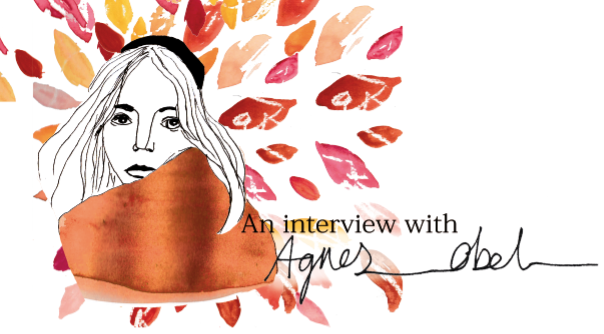
I then added text to the image, I used the same text as the previous image that I made because I think it worked really well and complemented the image.
Im not sure if it needs it or not because i quite like the image how it is already but I decided to tryout adding the leaves from the album cover to see how it looked.
Im not 100% sure yet but I think that I prefer this image for my editorial piece, I am going to give it some thought before I decide on my final image as I want to be completely sure on my decision.
Editorial part 1
After doing some research into Editorial artwork, I decided that I liked the look of using line work for the whole image with splashes of colour as I feel like it makes an image look really interesting. I started off by drawing a few pictures of Agnes Obel, as I couldn't draw from life I had to draw from already existing photographs from the internet. I decided to go with a stylised drawing as realistic drawing isn't my strongest point. I then added fine liner over the top of the drawings to make a more bold definite outline. Then I scanned in the drawings that I had done, I originally did 2 drawings so I could decide which one I liked best after playing around with them on photoshop. Here are the first drawn images before I scanned them in, for some reason I really messed up the right eye in the first drawing and didn't realise for ages but I drew a new one and fixed it together when I had scanned it all into photoshop.


I then fixed the eye and changed the levels to make the image look more crisp.

Then for the colour i decided to paint a rough rectangle of watercolour to be scanned in and used as my splash of colour, I decided the colour would work really well when used in the scarf as that is a very bold part of the image. I decided to leave the edges of the paint exposed as I think it adds an extra edgy look to the image.
 I Then decided that the image looked a bit boring and i wanted to have something happening in the background of the image, so to tie the editorial in with the Album cover that I designed I decided to use the leaves from that to create a pattern behind her head.
 I finally added some text because if it was in a magazine there would be a title for the article and I wanted to keep the same font that I used for the album cover because I feel as though it fit in really well with this style of drawing.

Overall I am really happy with how this turned out as it looks like I imagined it. Although I am pleased with this image, I am still going to make another image from the other drawing that I did of Agnes Obel, so i can decide which editorial image that I like best.
Then for the colour i decided to paint a rough rectangle of watercolour to be scanned in and used as my splash of colour, I decided the colour would work really well when used in the scarf as that is a very bold part of the image. I decided to leave the edges of the paint exposed as I think it adds an extra edgy look to the image.
Overall I am really happy with how this turned out as it looks like I imagined it. Although I am pleased with this image, I am still going to make another image from the other drawing that I did of Agnes Obel, so i can decide which editorial image that I like best.
Saturday, 1 November 2014
Editorial Artist research Sarah Hingle
After giving my editorial piece some thought I realised that it would be good to try and include a drawing of Agnes Obel herself as the article will be about her. I decided to look into an editorial illustrator that draws portraits for magazines. Sarah Hingle is an Australian illustrator that has worked for magazines from around the world including Elle magazine, Frankie magazine and milk and honey to name a few. Her style is very traditional looking as she draws very accurate portraits using pencil, a lot of her drawings are also brightened up with splashes of colour in the backgrounds. I think her drawings work really well because they are very delicate and pretty whilst remaining lifelike the colour she uses adds an extra element of interest and excitement, which I hope to achieve within my editorial piece. I am going to tryout drawing Agnes Obel in pencil and add colour for more interest and see how it works out. I don't know if ill be able to pull off drawing as realistically as Sarah Hingle does but ill give it a try and if it doesn't work out I can always simplify my drawing to suit me more.


Thursday, 16 October 2014
Editorial sketch
For my editorial design I decided to focus on an image that would go into a music magazine as I can't imagine Agnes Obel in a normal or fashion magazine as her music is more instrumental based rather than image based. For this I thought I should include her instruments and I wanted to link them to the album cover and poster so I decided to include the same style leaves swirling around them.
I drew a violin as they play a predominant part in most of her music and added the leaves around it. I will work over this image to refine it and when I have decided on colours I will proceed to colour the image. This is the sketch that I have at the moment.

I drew a violin as they play a predominant part in most of her music and added the leaves around it. I will work over this image to refine it and when I have decided on colours I will proceed to colour the image. This is the sketch that I have at the moment.
Friday, 26 September 2014
Editorial Research: Company Magazine
As we have been asked to create an editorial piece as well as the album cover I decided to do some research into editorial illustrations to get some ideas of what I can do in the future. When i thought about editorial illustrations immediately thought of company magazine as they often include illustrations and hand drawn typography with their articles. I really love the look of Company magazines as they are designed a lot nicer than a lot of other fashion magazines, they are more fin and interesting to look at.
Looking at the illustrations throughout company magazines pages it is clear that they are often fashion and beauty related and they all have a similar aesthetic to them to fit in with the magazines look. An artist called 'Mydeadpony' creates a lot of editorial style illustrations that are very modern and use a mixed range of media. He created a piece for Company magazine that included a girl and around the girl was drawings of things that link to the article that the image would go with. I like the idea of using the little drawings around the girl because it gives you an insight into what the article is about rather than having to guess. I also really like the round composition of the image I think it works well and gives contrast to the blocky columns of text on the opposite page. I have included an image of this illustration as it would have been sent in to the magazine and also how it looks with the finished article.


Looking at the illustrations throughout company magazines pages it is clear that they are often fashion and beauty related and they all have a similar aesthetic to them to fit in with the magazines look. An artist called 'Mydeadpony' creates a lot of editorial style illustrations that are very modern and use a mixed range of media. He created a piece for Company magazine that included a girl and around the girl was drawings of things that link to the article that the image would go with. I like the idea of using the little drawings around the girl because it gives you an insight into what the article is about rather than having to guess. I also really like the round composition of the image I think it works well and gives contrast to the blocky columns of text on the opposite page. I have included an image of this illustration as it would have been sent in to the magazine and also how it looks with the finished article.
Company magazine also include illustrations to demonstrate different make-up looks on their beauty page. I really like this idea because it is unique compared to a photo that might be in a normal magazine, I haven't seen this kind of thing done in any other magazine before but I prefer it. Natalie Lines is an illustrator from Birmingham that creates fashion illustrations that are often found in magazines. She created a make up page for Company magazine where she drew eye make up looks based off different fashion designers styles. I really like how she has kept the drawings pencil and just added hints of colour where needed, I think this really balances out the drawings. I think my favourite thing about this illustration is the subtle colour in the pupils of the eyes. The composition fits perfectly with the text and it flows really well. I think I would like to create an image with the same composition idea of just illustrating a little corner of the article as I think it draws the eye in a really good way. I also have included images of the original illustration as well as the finished page.
Subscribe to:
Posts (Atom)