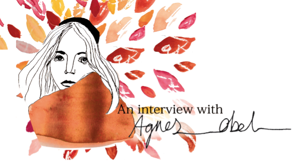
I then added some colour into the scarf, this time I decided to neaten the edges up and change the colour to a more burnt orange.
I then added text to the image, I used the same text as the previous image that I made because I think it worked really well and complemented the image.
Im not sure if it needs it or not because i quite like the image how it is already but I decided to tryout adding the leaves from the album cover to see how it looked.
Im not 100% sure yet but I think that I prefer this image for my editorial piece, I am going to give it some thought before I decide on my final image as I want to be completely sure on my decision.


No comments:
Post a Comment