Showing posts with label poster. Show all posts

Thursday, 30 October 2014

Poster Design

For my poster I wanted to create something a bit different from the album cover but using the same colours and theme of an enchanted forrest. I decided to expand on the cd case and instead of having leaves on it I wanted to create the whole forest. I did this by painting various tree shapes using the same colours that i used for the leaves on my cd case. I then added lots of different black tree trunks, I wanted to make the bottom part of the forrest quite dense with tree trunks to add more mood and to darken the image slightly. Next I added a dark background that I created with watercolour and the hand written text. The final thing that I wanted to do to add more interest to the poster is add a light glare coming from the forest trees, I feel like this adds to the story of the CD case because it looks like the scene from the CD is happening in the forest where the light is coming from. Overall I am pleased with how the poster turned out because I feel like it sets the right tone for the album. 
The next step is to print out the poster design onto A2 paper that has a grey sort of colour to it. I decided on this colour because I didn't want to use a paper as dark as the cd case because I feel like it would make the image too dark, but I didn't want to use a bright white paper either so this is a good middle ground. 


Tuesday, 21 October 2014

First colour tests

I decided that I wanted to try out screen printing the design for my poster. Before I went to screen print my image I thought that I would test out some colours to see what would work out as I hadn't really tested out any colours previously  and because ive never tried out more scandinavian colours before I thought this would help me out a lot. I looked at the research that I had done and selected a few colours inspired from their work, I also looked at some colours on a website called colour lover to help me out with palettes. These are the first two tests that I have created.

The colours in the first design looks a lot more like the colours that the artists that i have been looking at use but when I looked at it I think it looked a bit too barby ish. I do like the colours but im not too sure if they work that well. for the second image i decided to go with a more peachy, orange, autumnal colour for the main leaf but I kept the centre colour the same because I quite like that colour. I think I like the second design more because the colours work better together. Now my next task is to create similar colours in real life when I attempt to screen print my design. I am going to experiment with the colour of paper that I use for my final poster, I have got white, grey and brown A2 paper so I can experiment and see what works best with my design. I also have to decide if I want to include the character from the album cover and if so what colour I would like the character to be. 


Thursday, 16 October 2014

Poster thumbnails

I have sketched up some thumbnails for the design of my poster. I like both of the ideas but I think i'm leaning more towards the second option because the composition is more interesting than the first one. If I do go ahead with the second design I will have to work out if it needs text and if so where the text should go to make it look good and evenly balanced. I plan on screen printing my A2 poster to give it more of a scandinavian look and feel to it as a lot of illustrations from that part of the world look screen printed. This might be quite a task for me as I don't have much experience with screen printing but I know the basics and i'm up for the challenge of it. My next step is to decide on the colours and start doing test prints to see how it will look. Here are my initial thumbnails 


Tuesday, 14 October 2014

Poster research

As we have to create a poster for this brief I decided to look at a verity of different music posters to see what kind of styles and layouts I think work best. Whilst looking at music posters I realised that there were two different types of posters that are made for artists, posters that advertise the album/concerts and posters that fans would buy for their wall. Im not sure what kind of poster we have to create but for now I will research both types. Looking at these posters will give me more ideas and inspiration for creating my own poster for the Agnes Obel album Aventine.

Whilst searching for music posters I came across some Bombay bicycle club posters that advertise their concerts. Most if not all of their album art is designed by illustrator Katie Scott, Her work has a lovely delicate colour and line quality to it i think it works really well for the bands image. The art used on their albums and posters gives a very vintage vibe, they look although they are drawn in the style of old medical and science drawings. This style although it reflects times gone by is also very current and contemporary now as this style is starting to come into illustration more often.

 I have always loved their illustrated album covers so it was really interesting to see how the album designs translated onto posters. The thing I like most about this poster is the composition, I think because the image us central it has a really clear focal point. I also like how although it is attention grabbing the image is still really subtle and simple. I will experiment and try out a similar composition to this and see how it works with my poster design.


The Poster below is a Biffy Clyro poster advertising tour dates. The things that I think work best are the limited colours and the fact that it looks screen printed. I really like the navy blue on the yellow background as I feel that it makes the imagery really stand out, I also think that the illustrative typography for the bands name gives the poster a really quirky unique look and feel. The design and imagery matches the band well as they have very unique strange lyrics about all different things. I am thinking about designing my poster for screen printing as I really love the look and feel of a screen printed image. I also feel like if the poster is part of a limited edition box set then it will be nicer to have a screen printed poster rather than a run of the mill printed poster.  
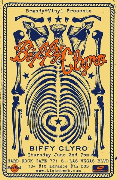


Overall I think that the sound and image of the musician or band is very representative in their poster designs. I will aim to get across the sound and feel of the artists music in my poster. And I now know that i'd like to create a screen printed poster for my final design.