As I was reading through Oranges are not the only fruit I started sketching down some thumb nails for the book cover, they are very rough so don't mind the terrible drawing they were just to give me a few ideas in terms of composition and what kind of imagery I wanted to include on the front. When reading the book I was finding it hard to just picture one image that would work for the story so I drew up lots of very different sketches, using different parts of the book for imagery, to see what ideas that I think worked best.
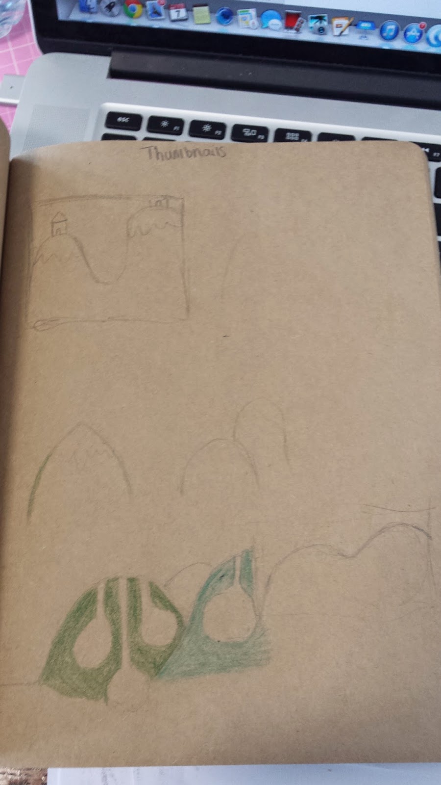
I decided from this that I liked the idea of using the top of the girls head and a thought bubble with the title of the book inside it. I liked this idea best because you cant see the characters full face, leaving some room for the readers imagination. I also thought this idea fit the way that the book is written well because its written from the girls internal monologue and her thoughts. I will now start to develop this idea further to see how it goes.
Showing posts with label thumbnails. Show all posts
Saturday, 3 January 2015
Tuesday, 2 December 2014
Thumbnails
I did some quick sketches of cover variations, they're not very detailed as they are just thumbnails but they give me an idea of how the compositions will look in my head. Drawing out my ideas also helped me realise what would work best where. I realised that I would have to think about the typography placement a lot so it helped me to visualise that as well.
I think I am going to work on and develop the first thumb nail as I think it is the most visually interesting. If that doesn't work out I have a few other designs that I can develop instead.
Thursday, 16 October 2014
Poster thumbnails
I have sketched up some thumbnails for the design of my poster. I like both of the ideas but I think i'm leaning more towards the second option because the composition is more interesting than the first one. If I do go ahead with the second design I will have to work out if it needs text and if so where the text should go to make it look good and evenly balanced. I plan on screen printing my A2 poster to give it more of a scandinavian look and feel to it as a lot of illustrations from that part of the world look screen printed. This might be quite a task for me as I don't have much experience with screen printing but I know the basics and i'm up for the challenge of it. My next step is to decide on the colours and start doing test prints to see how it will look. Here are my initial thumbnails
Labels:
design,
Non-Narrative,
plan,
poster,
rough,
thumbnails
Tuesday, 14 October 2014
Rough Album Designs
I have came up with a few different design ideas for my CD design, I just sat and sketched out a few different thumbnails to get more of an idea of what i think worked the best. Here are the drawings that I came up with.
This is the first design, it is a more refined version of a thumbnail idea that I drew when I thought of my initial ideas. I think this design works well because the composition looks very calm and simple. This matches the vibe and sound of the music. I decided to use the music and the forest for my concept so I put leaves all around the character in the middle as if the leaves are from an enchanted forest and they are protecting her. The central character is curled up in a ball and looks quite innocent but then she also had a cow tail, this adds a bit more of a dark twist to the image. I think the imagery in this design fits the sound and feel of the music quite well.
The second idea that I had for the CD design was to elaborate more on the central character and focus it more on her. I stuck with the layout of the first sketch as I think it works quite well. After I had drawn this I decided that I do like it but after some consideration I decided that it looks a bit childish. I think this design might work for another purpose for example a children's book or CD but maybe not so much for this album. For now I have decided not to take this design any further.
For my Third design I thought it would be good to make it more clear what is happening within the image, in this design it is easier to see that the leaves are actually enchanted and are moving towards the character to protect her. I wasn't sure about the typography placement but if I decide to go with this design I will develop that further. After trying out this layout I really liked it because I feel like it makes the image look more interesting. Because I like this design and the first design I though why not make this into the poster design, I feel like if this was the poster then the CD and poster would work really wall together because you might look at the album and wonder what is going on then when you see the poster it sort of adds another element to the story and it tells more of what is happening in the image.
I will now start to develop the final CD image and develop it further. I will also plan my poster design based off the third CD idea that i had.
Tuesday, 7 October 2014
Initial thumbnail sketches
here are sketches of the initial ideas that I had for the album covers they are only thumbnail very rough sketches at the moment to help me decide witch idea I like best.
These sketches are for a concept that I had based on a scandinavian folk tale about a man that buys a cat. I decided to try out drawing some cats curled up asleep because I love the shape that they make when they're all snuggled up. After drawing the thumbnails I decided that I did like the idea but I feel like it doesn't go that well with the sound and atmosphere that the album has.
The next concept that I had was based of the folk tale of the hill people that lived under the hills because they are scared of loud noises. I decided not to go through with this concept because it was very similar to something I had previously seen (read more about that here) and I couldn't figure out a composition that I liked.
These sketches are for a concept that I had based on a scandinavian folk tale about a man that buys a cat. I decided to try out drawing some cats curled up asleep because I love the shape that they make when they're all snuggled up. After drawing the thumbnails I decided that I did like the idea but I feel like it doesn't go that well with the sound and atmosphere that the album has.
![]() |
| Cat sketches |
The next concept that I had was based of the folk tale of the hill people that lived under the hills because they are scared of loud noises. I decided not to go through with this concept because it was very similar to something I had previously seen (read more about that here) and I couldn't figure out a composition that I liked.
![]() |
| Hill people rough sketches |
The final concept idea that I have is based off a Folk tale called Huldra about a woman who gets given a cow tale and she has to hide it from normal people. (Read the folk tale here) The moment I read this story I really liked it and it made me think of a woman that lives in an enchanted forrest. When I listen to Agnes Obels music it makes me think of a beautiful forest with an undertone of darkness. I think this idea would work really well for the album concept. Here is a very rough sketch of the idea I have, sorry for the bad photo ill upload a better one the next time I have that sketchbook on me.
![]() |
| Huldra rough sketch |
Subscribe to:
Posts (Atom)


