Showing posts with label oranges are not the only fruit. Show all posts
Showing posts with label oranges are not the only fruit. Show all posts
Monday, 12 January 2015
oranges are not the only fruit concept
The concept for this book cover was to bring an older story into the modern age attracting a younger audience to the book. I wanted to create a clean modern look whilst not referencing directly that it was a particularly modern story. I also wanted to get across the girls feelings of sadness so the audience will know the overall tone of the book. I wanted to portray idea of thoughts and writing down notes as this is referenced a lot throughout the book. I feel that the angle that I have decided to go with for the concept is quite risky because it doesn't focus directly on the story but more the main character and the feelings that she has.

Module evaluation part 2: Oranges are not the only fruit
Alongside creating the carries war book cover I began to read and
develop ideas for the book Oranges are not the only fruit. When I was reading
this book not one single image stood out to me that would work well on a book
cover because there were so many topics and themes covered in the book. The
main themes are religion and lesbian love but alongside this there are a lot of
stories and bible verses. Because no images came into my mind I started to
sketch lots of different thumbnails out to see what came from it. This proved
very beneficial as it helped me to decide what I liked the look of most.
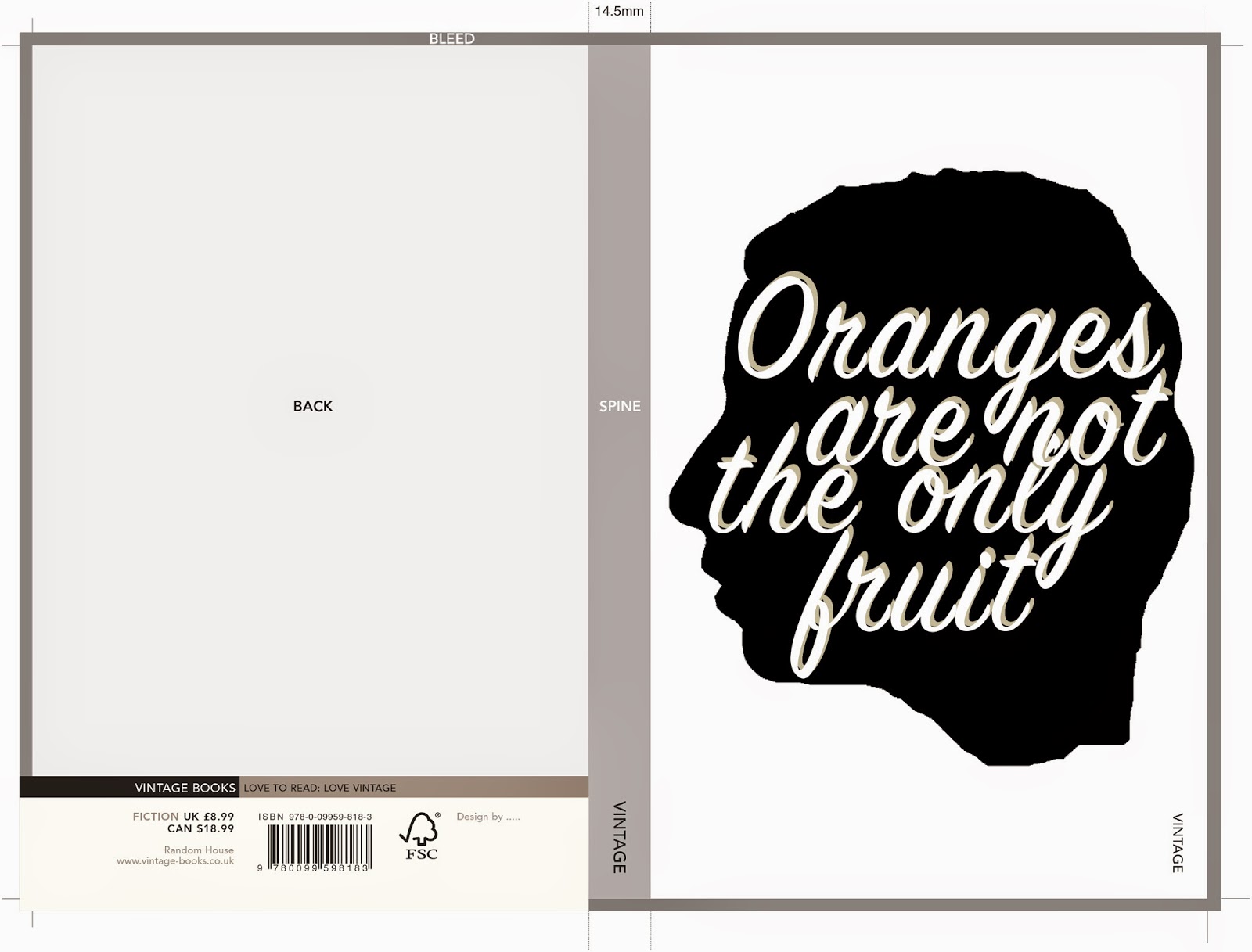
I started off by creating a silhouette style image using my own
profile for the girl head. I then added the title of the book within
the silhouette, I think the design was okay but nothing really special.
After completing this cover I realised that this cover idea was very similar to
the cover for ' The colour Purple,' another lesbian love story, I would not be
able to use something so similar to something that already existed. I am glad
this happened because it allowed me to think more and expend my ideas and
designs. I went back to my thumbnails and had a look through the other
ideas that I had, I saw a sketch of a girl at the bottom of the page and the title
above her head as if it was her thoughts. I really liked this idea but my next
decision was to choose the style that I wanted to create the book cover in. At
this point, I don't really know why but the Eleanor and Park book cover popped
into my head and it gave me the idea to create a really modern book cover for a
quite old dated story, a similar thing to what the Eleanor and Park book cover
did. I thought that tis idea would attract a new more young audience to the
book, a market that usually wouldn't even think to pick this book up. I thought
it would be a good idea to refresh the book and bring it into this age.
I then started on designs. As the brief specified a strong use of
typography I decided to make this the focal point of the book I wanted to create
a really nice quirky hand written title for the book. I’m not too great with
digital fonts so I thought I would do what I know and just draw the letters. I
kept it in quite a loose style so it looks as if someone could have doodled it
down onto paper because there are a lot of notes that get written throughout
the book and I feel as though this fits with the story. I also decided to have
the books background as lined paper so it really looked like a note. I am
pleased with how the text turned out considering I don't think I'm that good at
typography. I then drew the design for the girl at the bottom of the page, I
wanted her to look sad because throughout the book that seems to be the feeling
that she feels the most. I decided on a simple line drawing to keep the design
clean, simple and modern. After scanning it in and putting it on Photoshop I
decided to colour the hair and eyebrows with a light orange to reference to the
title and the oranges from the story.
I then added all of the digital text such as the author name and
quote. I put the authors name in a band the same colour as the girl’s hair, I
think this contained the name nicely and brought the image together and
balanced it out so it was no longer bottom heavy. I continued the orange band
onto the spine and the back page. I think this makes the back and front of the
book work together as a cohesive piece. I decided to use my hand writing for
the blurb so that again it looked like a note that someone had written. I think
that it balanced out the use of digital and hand written text nicely making it
look professional as opposed to a hand made DIY book cover. After adding all of
the text to the back cover I decided that it did feel a bit plain and it
needed something extra. I decided to then add some doodle style motifs
referencing themes in the book, I decided to keep them in the orange accent
colour that I used throughout the design.
Overall I am
really pleased with how this book cover turned out because I think it looks
really modern and quirky and I would probably pick it up if I saw it on a
bookshelf. I also really like the illustration style, I would like to play
around with this style a lot more in the future. I feel as though it is a real risk for me to enter this as
a cover as it is so modern for a story set in the 60's but who knows it could
really work as a re brand of the story and bring it into the modern day. I
think that a cover like this would really attract a new audience to the book.
If I was to re do this project I think that I would maybe spend a little bit
more time making sure everything is tidied up and polished to an even higher
standard But I am quite pleased with how professionally it has came out
compared to previous projects. Personally I really think that I am improving
with creating a more professional finish compared to last year, I think that I
can keep up with this and be even more meticulous to create projects with the
an even higher standard in the future.

Oranges are not the only fruit: Final design in template
This is the final design for Oranges are not the only fruit in the temple that Penguin set.
 Overall I think that this book design turned out very modern which was what I was aiming for and I think it works for the story but i'm not sure if people judging it will agree but its just a chance that ill have to take. I will now write an evaluation and post that in a different post.
Oranges are not the only fruit: Spine
For the spine of the book I decided to keep it simple as there is not much space to work with so I used the same style of text that I used for the authors name on the front, on the spine.
I then, for the book name, used the same font that I used on the blurb. It is a hand written style so I think that it fits in well with the rest of the book design. I then decided that it looked quite plain and it might not catch someones eye in a shop. To target this I decided to use the little motifs that were on the back of the book on the spine as well, I think this adds another element of interest . I also added the vintage logo that penguin specified had to be on the spine.

I then, for the book name, used the same font that I used on the blurb. It is a hand written style so I think that it fits in well with the rest of the book design. I then decided that it looked quite plain and it might not catch someones eye in a shop. To target this I decided to use the little motifs that were on the back of the book on the spine as well, I think this adds another element of interest . I also added the vintage logo that penguin specified had to be on the spine.
Oranges are not the only fruit: back cover
I decided that I wanted to use the same lined paper on the back cover of 'oranges are not the only fruit' as I did on the front. I also decided to keep the same style that I did the authors name for the back cover quote, I feel as though this ties the back and front cover together.
 This is the back cover with only the quote. The next step is to add the blurb and anything else that has to be included on the back cover.
 I then thought about how I wanted the font of the actual blurb, I decided that It would be good if I could use my own hand writing as I did for the front of the book. I created my own font and then typed up the blurb. I think this worked out quite well because it looks like someone has just wrote it on the lined paper, this is the look that I was going for because it ties in with the story quite well as the mother in the story writes Janette a lot of notes.
 I then added the other quote I wanted to do this in a different font yet again just so it was clear that it was not part of the blurb. I think it adds balance to the page and makes it look more interesting because there are different styles of type to look at.

After looking at the back page I decided that it looked too top heavy, The bottom would be slightly cut off anyway because of the template provided by penguin but there was still too much blank space. To combat this I decided to draw some little doodle style motifs using subjects covered in the story, I think it worked out well and gave a few more clues to what the book is about without having to read the blurb.
Saturday, 10 January 2015
Oranges are not the only fruit front cover
I used the letters that I made to create the title on the front of the page. Because the title was hand drawn I felt as though the author and quote should be done in digital typography to balance it out. To add some orange into the cover I created an orange band for the author name to go into. I then added a sad looking girl to the bottom of the page I feel as-though this gives the cover more balance than if it just had the text. Here is a very rough digital copy that i started with only using text that I had scanned in.

I decided that this looked too plain so I re thought what should be on the cover and the composition of it. this was when I decided to add the illustration of a girl to the bottom of the page and move the author name up to the top of the page. I also added the quote that goes on the front cover. There was also a shadow on the original lined paper so I re scanned some in to solve that issue. Here is those covers.


I went back to the second image for my final book cover design as I feel it was stronger being a bit more simple. The next step is to create the back cover to accompany this cover.
I then decided to try out putting a thought bubble around the text to make it look like it was the girls thoughts. After doing this I decided that I didn't like it at all because it looked too clumsy and cluttered, plus I wanted it to look like a note as well as a thought, as if the girl has written her thoughts down, because there are a lot of notes written throughout the story.
Wednesday, 7 January 2015
Oranges are not the only fruit Title typography
For this cover I wanted to use a hand written style for the title of the book, I decided this because im not that good at digital typography and knowing what looks good where and when I just write it myself things turn out looking a lot better. I also thought this would look a bit more unique and interesting compared to a standard digital font. I just began randomly scrawling the words from the title onto a piece of scrap paper. I then decided which style of lettering that I liked for which words. When I had decided on my favourites and the order that they should go in, I re drew them the way that I wanted them on the page. I then scanned them in so I could compose the cover digitally. The paper had a few shadows on when I had scanned it so I am going to scan in a new piece of paper and move the text onto the new paper background. I really like how it is looking so far, the next step is to add the illustration of the girl to the bottom of the page, the author name and any text has to go on the front.


Tuesday, 6 January 2015
Book cover research: Eleanor and Park
As for the 'Oranges are not the only fruit' I am creating a pretty contemporary cover for a story that is set in the 60's I felt that it was appropriate to reference the book 'Eleanor and Park' by Rainbow Rowell. It is a romantic novel that was written in 2013 but is set in 1986. I am aware that 1986 wasn't that long ago but the cover very much looks like this is a very contemporary story. Two book covers have been released for it and they are both very modern and don't reference the time period that the story is set in at all. Despite this the book has been incredibly successful. I think it is a really good thing sometimes for older books or books set in a different time period to have modern covers to open the book up to a new younger market that usually wouldn't consider even picking the book up. In my opinion If this book cover had been done in a style that referenced the time it was set in, I don't think it would have been half as successful. I know they say you shouldn't judge a book by its cover but its clear that people will and do, do that because it gives the first impression of whats inside. I really like both of these covers and although I haven't yet read the book these covers encourage me to, and I think I will when I have some spare time.
 |
| Eleanor and Park book cover, Image taken from: http://pixgood.com/eleanor-and-park-book-cover.html |
 |
| Emeanor and Park Book cover 2, Image taken from: http://pixgood.com/eleanor-and-park-book-cover.html |
Saturday, 3 January 2015
Oranges are not the only fruit experimentation
After drawing up my thumb nails I decided to have a play around with a few different ideas. I thought of creating a silhouette of someone so that it could be anyone that you want to imagine. I got the idea of carving it into an actual orange to see how it worked out. I tried it then photographed the orange with a few different lighting points to see how it looked.


I didn't like how this looked at all I just couldn't see how this would work on a book cover so I decided to forget this idea and try out another way of using a silhouette I tried out creating a digital one (I used my own head.) I think this actually looked okay but after I had created it I thought it looked familiar, then I remembered it was very, very similar to 'The Colour Purple' book cover and that book is the same genre as oranges are not the only fruit so I would definitely not be able to use this idea. Its okay though because I think that I can push this cover further and create something better anyway. Here I have inserted my designs and the design from 'The Colour Purple.'


After this experiment I've decided to go back to my thumbnails and have a re think of what I can do. I think there are a lot more options that I can try out.
I didn't like how this looked at all I just couldn't see how this would work on a book cover so I decided to forget this idea and try out another way of using a silhouette I tried out creating a digital one (I used my own head.) I think this actually looked okay but after I had created it I thought it looked familiar, then I remembered it was very, very similar to 'The Colour Purple' book cover and that book is the same genre as oranges are not the only fruit so I would definitely not be able to use this idea. Its okay though because I think that I can push this cover further and create something better anyway. Here I have inserted my designs and the design from 'The Colour Purple.'
Oranges are not the only fruit- Thumbnails
As I was reading through Oranges are not the only fruit I started sketching down some thumb nails for the book cover, they are very rough so don't mind the terrible drawing they were just to give me a few ideas in terms of composition and what kind of imagery I wanted to include on the front. When reading the book I was finding it hard to just picture one image that would work for the story so I drew up lots of very different sketches, using different parts of the book for imagery, to see what ideas that I think worked best.
I decided from this that I liked the idea of using the top of the girls head and a thought bubble with the title of the book inside it. I liked this idea best because you cant see the characters full face, leaving some room for the readers imagination. I also thought this idea fit the way that the book is written well because its written from the girls internal monologue and her thoughts. I will now start to develop this idea further to see how it goes.


I decided from this that I liked the idea of using the top of the girls head and a thought bubble with the title of the book inside it. I liked this idea best because you cant see the characters full face, leaving some room for the readers imagination. I also thought this idea fit the way that the book is written well because its written from the girls internal monologue and her thoughts. I will now start to develop this idea further to see how it goes.
Sunday, 14 December 2014
Book cover inspiration? - Oranges are not the only fruit
Recently iv'e been looking for ideas and inspiration for the cover of 'Oranges are not the only fruit' because, although there is a lot of information and different themes in the book I wasn't getting many ideas or imagery for a cover design. I have been keeping an eye out and looking all over for some influences, here are a range of things that I have found around that have given me ideas. Hopefully this blog post will help me sort out the ideas that I have and help me to realise what ideas that I like the best.
I came across this pantone puzzle book whilst looking on the internet, I really liked how on the right hand page had a shape made out of block colour and a pattern shining through behind it. I thought this style would look great as a simplistic cover and it would also work well because I could take great inspiration from 1960's patterns as thats when the book is set. it would also be quite fitting if I used the shape of an orange for the cut out, as the book mentions oranges a lot, although the title suggests that it doesn't. I might try out a cover in this style after doing some thumbnails.


Another image that gave me a good idea is a book cover that already exists by Jamie Keenan, it uses a pretty rough pen drawing but the design is pulled together by a professional, clean, digital font. I really like the way the image is drawn on lined notebook paper as opposed to plain white. I think that something with a similar idea to this would work for 'Oranges are not the only fruit' as the mother in the story writes notes a lot. I think it would work to create a sort of doodle page but using themes from the book for doodles for example a cross, oranges, a bible ect.


The last thing that has really inspired me lately is a video for the song Anclebiters by Paramore. I spotted this video out of the corner of my eye because it looked so pretty. It was created by an artist/ illustrator/animator called Jordan Bruner. I really love the style and colours that are used, they are very eye catching. I think that a book cover with a similar vibe to this video would create a very modern twist on the book. this could be a good idea to look into as I feel this would attract a more modern audience to this classic book.
Thursday, 4 December 2014
Oranges are not the only fruit
For my second book cover design I have chosen to illustrate a cover for Oranges are not the only fruit because it is a fiction book and I feel like it will be easier for me to read that rather than freakanomics although that does sound interesting too. I feel as though I can get more information and symbolism from a fiction book because it has a fully developed story with lots of different characters and themes. As a starting point I thought I would have a look at previous book covers that have been designed for this book. My next step is to read the book and think about what id like to create for the cover it shouldn't take me to long to read so I can start on my concepts quite soon.
 Im not to keen on the above cover, personally i'm not too fond of the illustrative style but there are a few other things that I don't think work that well. For example the border is very strange for a book cover because it just goes down one side of the image, and I feel although the text is slightly boring and harsh against the illustration that has barely any black in it.
 I think the above cover is quite nice in the way that it gives a vintage classic a modern look. The quality of the drawing looks modern and the fact that the character has tattoo's really brings it into this day in age because when the book was set tattoo's would have been very taboo. The bright use of Orange against the washed out drawing gives the cover a really eye catching pop as well.
 I do like the above cover but I think that compared to the one above it, it is not as strong of an image, I think this is because it is less focused compared to the other cover and I think the negative space at the top of the page makes the image look un balanced. I know that there is text there but I think if it was re arranged a bit it would work better.

In my opinion this is the strongest cover I think its because it is very unique compared to all of the other covers. I like the more simplistic look and the composition of the text and image, I think they work well together. I also really like the colours that have been used in this cover because I think that the orange bible really stands out against the blocky black.
Overall I have concluded that i like the more modern looking covers so I would like to go down the route of creating a more modern looking cover rather than a cover that represents the time period that the book was written in.
Overall I have concluded that i like the more modern looking covers so I would like to go down the route of creating a more modern looking cover rather than a cover that represents the time period that the book was written in.
Subscribe to:
Posts (Atom)