Showing posts with label penguin. Show all posts

Monday, 12 January 2015

Module evaluation Part 1: Carrie's War

At the beginning of this module I was pretty overwhelmed with the amount of amazing briefs that we were given to choose from. It was quite a challenge for me to choose which one I wanted to do, so I thought really hard about what will benefit me most in terms of experience and opportunities that I could gain from it. I narrowed it down to the traveling man zine and the Penguin book cover competition briefs. After a lot of thought I decided that I can always work on zines and self publish them in my own time where as the penguin competition only comes around once a year, plus its only for students to enter meaning that when I leave university I cant enter it and I might as well make the most of it whilst I can. So in the end I decided to go ahead with the Penguin book cover competition. One thing that helped me to decide to do the penguin brief was the opportunities you could gain from winning the it or even getting short listed because it would definitely get you noticed within the industry.  I also thought that I would like experience in designing a book cover as I really love to read and it would be good to work alongside books in some way, in the future.

When I started to look more into the brief, the next thing to do was choose two from the three books to design a cover for. The three choices were: Oranges are not the only fruit, Freakanomics and Carrie's War. I decided quite quickly to do Carries War (the children's book) and Oranges are not the only fruit (the adult non-fiction book) because these were the two novel style books and I thought that I might enjoy reading the books anyway. Ill start with evaluating my Carries War book cover because that’s where I began. I started off reading the book pretty quickly, I soon discovered that the book was about evacuated children in World War 2. Although I enjoyed the book and it brought me back in time feel as though the story definitely lacked a gripping storyline especially for a children's book. All of the previous covers that I looked at didn't really represent the story at all because they showed scenes of war and destruction in London where none of that happened within the book. After reading the story it struck me that it was going to be hard to make such an empty story look exiting for children and make them want to pick it up off the shelves. Then it hit me, I thought why not just create the creepy woods that the children walk through throughout the story because that was the main part of the story that had a lot of description.

I started out with a few sketches of how I imagined the cover in my head and thought it would be appropriate to include the two main characters and the house that the children are going to (Hepsibah's House.) I wanted to create a woodland scene with lots of depth, my idea was that this would draw children looking in the bookshop into the scene and make them want to read the book. To make the image look really interesting and unique I decided to take my illustrations to a 3D medium. I have done this before and I really liked the look that it gave but it wasn't finished to that high of a standard so I thought that I could really push this technique and really improve it I looked at a few different artists for inspiration such as Hari and Deeppiti, they were a big influence. I then created illustrations of the trees and people that I wanted to make the scene from and I cut out a tester using cartridge paper and it took me a pretty long time to get all of the intricate detail that I wanted in the trees, after realising how long this was going to take I thought about my options. I was then given the idea to try out using the laser cutter. I really liked the idea of using it and was really exited to learn a new tool that I could use to create 3D illustrations. I then created my illustration outlines digitally using Adobe Illustrator. I then booked a session to use the laser cutter and the technician helped me to achieve what I wanted. I really, really love the finish that the laser cutter gives and it helped push my design to another level I was very pleased with my outcome. I wasn't planning for it but the laser cutter left slight scorch marks around the edge of the cuts and I really liked the colouring that it made on the white mount board it added real character. The look of the scorch marks also referenced war time really well because there will have been a lot of destruction and devastation from bombs and of course fire so there would have been a lot of scorched debris around at this time in history.

After using the laser cutter the next challenge for me to conquer was for me to photograph the scenes to create the final images. This was by far one of the hardest points of creating this book cover. As I don't have that much experience with photography or lighting it was very hard to work out the best way to light the scene. After a lot of trial and error and some help from the photography tutors we finally figured out the best lighting angles, and it took a while but in the end we got the perfect shots. I think when we got the lighting right it really transformed it to a magical scene and drew you in. This is exactly what I wanted. If I was to have any criticisms it would be that the photograph on the front cover was lit slightly differently than the front because it was harder to lighting right as a lot of shadows were being cast onto the house. I am still really pleased with the result though. After deciding on the two final images I then took them to Photoshop to edit the levels and the hue/saturation. I wanted to make the dark bits slightly darker and the light parts lighter, I did this by editing the levels. I then added a warm orangey/yellow hue to the whole image to make it look more inviting and warm. I think this really helped the image to look more like a children's book because it had a nice nostalgic look to it, It reminded me a bit of when you think of a happy memory and in your head the image has a whole warm glow to it.

Finally I added the Title, author name, Blurb and spine to the book design in Photoshop. I feel as though the front cover looked really nice and the title and author really completed the look of the front cover. I then added the blurb, this was also laser cut but it was engraved into a square piece of mount board rather than fully cut out of it. I really liked the look of the laser cut blurb but i'm not too sure how well it worked on the back of the book because it was very square and it was covering up a lot of detail of the trees. I tried other ways of placing the blurb and I tried a few ways of improving the look of it like changing the transparency and size of it, I even tried making it look like it was amongst the trees but a lot of the text was not readable. I think I will just have to deal with the way that it looks because a blurb is a very necessary part of a book back, even of its not the best designed part its one of the most important elements so I feel that its not that big of a deal that it stands out quite a bit because it does its job. 

Overall I am really pleased with how this book design has turned out, I was not too sure initially how good I would be at creating a book cover that worked with the story but I feel that I really have. Its hard to tell if it will be what the judges are looking for but I certainly think it will be unique against other entries so it will hopefully catch a few eyes. If I was to do this project the only thing that I would change is the slight issue with the blurb on the back of the book, I think I would plan for it to fit better within the image. Other than that I feel as though I have completed this module to a pretty high standard with no real major issues. I even feel as though my time management has even improved as I have finished everything with a little bit of time left to tweak things as opposed to working right up to the deadline. I also managed to complete it whilst keeping on top of all my other written work, which I am quite proud of.   


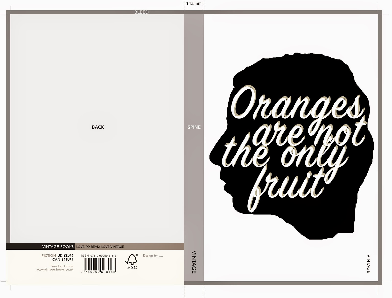
Oranges are not the only fruit: Final design in template

This is the final design for Oranges are not the only fruit in the temple that Penguin set.

Overall I think that this book design turned out very modern which was what I was aiming for and I think it works for the story but i'm not sure if people judging it will agree but its just a chance that ill have to take. I will now write an evaluation and post that in a different post.

Carrie's War: Final design in the template

Here is the finished design Within the template that penguin set.


Overall I am pleased with how this design turned out, I might still play around with the blurb a bit before deadline to see if I can improve it in anyway.  I will now post an evaluation of this module in a separate post.

Carrie's War spine

To create the carries war spine I simply used the text from the front of the book and chose a colour foe the background that I thought brought the whole book together. I decided on a dusty brown colour as the front and back images had an orange/warm glow to them and I felt as though this colour was a nice  warm tone complemented the rest of the book. It looks quite plain on its own but with the rest of the book I think it works well.


Oranges are not the only fruit: Spine

For the spine of the book I decided to keep it simple as there is not much space to work with so I used the same style of text that I used for the authors name on the front, on the spine.
I then, for the book name, used the same font that I used on the blurb. It is a hand written style so I think that it fits in well with the rest of the book design. I then decided that it looked quite plain and it might not catch someones eye in a shop. To target this I decided to use the little motifs that were on the back of the book on the spine as well, I think this adds another element of interest . I also added the vintage logo that penguin specified had to be on the spine.  

Editing the Carrie's War photograph in photoshop: Front cover

I started off with the original image that i took in a studio with studio lighting.


 I then straightened the image up and changed the levels to make the lighting and shades look how I wanted them to, This involved mainly darkening up the image a bit and lightening the back of the image more. I then changed the hue/saturation to make it have more of an orangey/yellow glow like the back page does. I think changing the levels helped me to achieve the look that I wanted.


 I then added in the title of the book I decided to have it at the bottom of the design because I thought that this made the perspective look good, the text actually looks like its in front of the scene. I then added a little bit of colour like the image but I wanted it to be slightly lighter so it showed up well against the background.


I did the same to the author name but added it to the top of the image to balance it out. I think this cover turned out well after some editing on photoshop. It looks how I originally intended so I am pleased with it.

Oranges are not the only fruit: back cover

I decided that I wanted to use the same lined paper on the back cover of 'oranges are not the only fruit' as I did on the front. I also decided to keep the same style that I did the authors name for the back cover quote, I feel as though this ties the back and front cover together. 
 This is the back cover with only the quote. The next step is to add the blurb and anything else that has to be included on the back cover.  
 I then thought about how I wanted the font of the actual blurb, I decided that It would be good if I could use my own hand writing as I did for the front of the book. I created my own font and then typed up the blurb. I think this worked out quite well because it looks like someone has just wrote it on the lined paper, this is the look that I was going for because it ties in with the story quite well as the mother in the story writes Janette a lot of notes. 

 I then added the other quote I wanted to do this in a different font yet again just so it was clear that it was not part of the blurb. I think it adds balance to the page and makes it look more interesting because there are different styles of type to look at. 


After looking at the back page I decided that it looked too top heavy, The bottom would be slightly cut off anyway because of the template provided by penguin but there was still too much blank space. To combat this I decided to draw some little doodle style motifs using subjects covered in the story, I think it worked out well and gave a few more clues to what the book is about without having to read the blurb.

Photographing my Carrie's War cover: Front page

The front cover photo was harder to get right compared to the front cover as it was hard to light the image correctly as the house couldn't be too dark as the detail would be lost. This took a lot of trial and error, here are the photos that we started with. (they are slightly wonky but the final image wont be)


 This was the first photo that we took, the lighting was completely off and there was all sorts of shadows being cast on the house so the lights had to be re positioned to eliminate this issue. Another problem with this image is the tree positions, they are too far away from each other so there is huge visible gaps between them.  


 The previously issue was now resolved and I tried photographing the scene with the title in the photo. I didn't like how this looked because it was hard to see the title. I took the title off and decided that I would add it later in photoshop. 


 This was getting closer but was still slightly too dark and a lot of the house detail was being lost. Also the top of the image was blurred and out of focus.


This is the image that I decided to work with in the end because the detail in the house was nicely visible.  The front trees are not as dark as I would have liked them to be but I couldn't get the trees dark and the house light because they were quite close together. I think once this image is edited in photoshop it will work out how I want it to. 

Saturday, 10 January 2015

Oranges are not the only fruit front cover

I used the letters that I made to create the title on the front of the page. Because the title was hand drawn I felt as though the author and quote should be done in digital typography to balance it out. To add some orange into the cover I created an orange band for the author name to go into. I then added a sad looking girl to the bottom of the page I feel as-though this gives the cover more balance than if it just had the text.  Here is a very rough digital copy that i started with only using text that I had scanned in. 

I  decided that this looked too plain so I re thought what should be on the cover and the composition of it.  this was when I decided to add the illustration of a girl to the bottom of the page and move the author name up to the top of the page. I also added the quote that goes on the front cover. There was also a shadow on the original lined paper so I re scanned some in to solve that issue. Here is those covers. 


I then decided to try out putting a thought bubble around the text to make it look like it was the girls thoughts. After doing this I decided that I didn't like it at all because it looked too clumsy and cluttered, plus I wanted it to look like a note as well as a thought, as if the girl has written her thoughts down, because there are a lot of notes written throughout the story.  


I went back to the second image for my final book cover design as I feel it was stronger being a bit more simple. The next step is to create the back cover to accompany this cover.


Friday, 9 January 2015

Editing the Carrie's War photograph in photoshop: back cover

After taking my photos for the book cover, I decided to play around with the levels and the hue/ saturation to try and get it looking how I would like. I wanted the definition between the layers to be more clear and I also wanted to warm the image up a bit to make it look like it had more of an orange glow, rather than a bright one, I also straightened it up. Im really pleased with how this has turned out but the real challenge for me now is to work out how i'm going to insert the blurb and barcode into the image so it still looks good. Here are the images before and after they have been edited.


Wednesday, 7 January 2015

Oranges are not the only fruit Title typography

For this cover I wanted to use a hand written style for the title of the book, I decided this because im not that good at digital typography and knowing what looks good where and when I just write it myself things turn out looking a lot better. I also thought this would look a bit more unique and interesting compared to a standard digital font. I just began randomly scrawling the words from the title onto a piece of scrap paper. I then decided which style of lettering that I liked for which words. When I had decided on my favourites and the order that they should go in, I re drew them the way that I wanted them on the page. I then scanned them in so I could compose the cover digitally. The paper had a few shadows on when I had scanned it so I am going to scan in a new piece of paper and move the text onto the new paper background. I really like how it is looking so far, the next step is to add the illustration of  the girl to the bottom of the page, the author name  and any text has to go on the front. 


Tuesday, 6 January 2015

artist research: Fran Meneses

I decided to have a look at Fran Meneses or better known as Frannerd for my research for my oranges are not the only fruit book cover. Fran is an illustrator that lives in Berlin she creates very cute little cartoon style drawings that often are based on real life things that happen day to day. She creates zines, cards, stickers and calendars along with a few other things on her etsy store and also makes youtube videos about her life as a free lance illustrator.  
I received one of her zines for christmas as a gift and it really inspired me with this book cover because I was really stuck with what to do for it so I took a break for a while and sat down and read the zine. I really liked the scrap book feel to it and I also am a big fan of how the different hand drawn typography all works together on one page so well. I also think that the delicate line quality is really nice. Overall I just really like cuteness and the simplicity of her drawings. Here a few different drawings that I really like and a video from her youtube channel. 


From the zine 'Perfect tree shapes' Photo taken from From: http://frannerdsblog.blogspot.co.uk/search?updated-max=2014-07-
01T12:29:00%2B02:00&max-results=10&start=10&by-date=false
Image taken from:
 http://frannerdsblog.blogspot.co.uk/search?updated-max=2014-07-01T12:29:00%2B02:00&max-results=10&start=10&by-date=false
Image taken from:
 https://www.dropbox.com/s/s899uf5c88jfsqd/Screenshot%202015-01-06%2011.21.22.png?dl=0

Saturday, 3 January 2015

Oranges are not the only fruit experimentation

After drawing up my thumb nails I decided to have a play around with a few different ideas. I thought of creating a silhouette of someone so that it could be anyone that you want to imagine. I got the idea of carving it into an actual orange to see how it worked out. I tried it then photographed the orange with a few different lighting points to see how it looked.


I didn't like how this looked at all I just couldn't see how this would work on a book cover so I decided to forget this idea and try out another way of using a silhouette I tried out creating a digital one (I used my own head.) I think this actually looked okay but after I had created it I thought it looked familiar, then I remembered it was very, very similar to 'The Colour Purple' book cover and that book is the same genre as oranges are not the only fruit so I would definitely not be able to use this idea. Its okay though because I think that I can push this cover further and create something better anyway. Here I have inserted my designs and the design from 'The Colour Purple.'


After this experiment I've decided to go back to my thumbnails and have a re think of what I can do. I think there are a lot more options that I can try out.

Oranges are not the only fruit- Thumbnails

As I was reading through Oranges are not the only fruit I started sketching down some thumb nails for the book cover, they are very rough so don't mind the terrible drawing they were just to give me a few ideas in terms of composition and what kind of imagery I wanted to include on the front. When reading the book I was finding it hard to just picture one image that would work for the story so I drew up lots of very different sketches, using different parts of the book for imagery, to see what ideas that I think worked best. 
I decided from this that I liked the idea of using the top of the girls head and a thought bubble with the title of the book inside it. I liked this idea best because you cant see the characters full face, leaving some room for the readers imagination. I also thought this idea fit the way that the book is written well because its written from the girls internal monologue and her thoughts. I will now start to develop this idea further to see how it goes. 


Sunday, 14 December 2014

Book cover inspiration? - Oranges are not the only fruit

Recently iv'e been looking for ideas and inspiration for the cover of 'Oranges are not the only fruit' because, although there is a lot of information and different themes in the book I wasn't getting many ideas or imagery for a cover design. I have been keeping an eye out and looking all over for some influences, here are a range of things that I have found around that have given me ideas. Hopefully this blog post will help me sort out the ideas that I have and help me to realise what ideas that I like the best.  

 I came across this pantone puzzle book whilst looking on the internet, I really liked how on the right hand page had a shape made out of block colour and a pattern shining through behind it. I thought this style would look great as a simplistic cover and it would also work well because I could take great inspiration from 1960's patterns as thats when the book is set. it would also be quite fitting if I used the shape of an orange for the cut out, as the book mentions oranges a lot, although the title suggests that it doesn't. I might try out a cover in this style after doing some thumbnails.  


Another image that gave me a good idea is a book cover that already exists by Jamie Keenan, it uses a pretty rough pen drawing but the design is pulled together by a professional, clean, digital font. I really like the way the image is drawn on lined notebook paper as opposed to plain white.  I think that something with a similar idea to this would work for 'Oranges are not the only fruit' as the mother in the story writes notes a lot. I think it would work to create a sort of doodle page but using themes from the book for doodles for example a cross, oranges, a bible ect.   


Whilst I was researching paper cutting for my other book cover, I came across this image. It really sparked an idea to create something using an orange shape with the title cut out of the paper and some really effective lighting. I think I could try this out and it could look really effective whilst remaining simple and clean. 

The last thing that has really inspired me lately is a video for the song Anclebiters by Paramore. I spotted this video out of the corner of my eye because it looked so pretty. It was created by an artist/ illustrator/animator called Jordan Bruner. I really love the style and colours that are used, they are very eye catching. I think that a book cover with a similar vibe to this video would create a very modern twist on the book. this could be a good idea to look into as I feel this would attract a more modern audience to this classic book. 


I will now create some thumbnails using these images as inspiration and see how my ideas develop. I might work on a few different covers to see what progresses best. 

Tuesday, 9 December 2014

Using the laser cutter

As I had created all of my designs and cut them out by hand previously to practice, I discovered that it would take me a very long time to cut out everything that I needed by hand and I wouldn't be able to get it done in time to a very high professional standard. Because of this I decided to look into ways that I could fix this and decided that trying out a laser cutter would be my best option. I tracked down the laser cutter in uni and got some help from an experienced technician. He told me to make all of the shapes that I wanted cutting out in illustrator and told me the specifications to save all of the lines as. These are some of the the templates that I made for the laser cutter. 


When I went to use the laser cutter, I tried out a different things for example I tried putting paper on top of my mount board to reduce the scorching that the laser leaves as it was not my original intention to have scorch marks. The paper technique didn't reduce the scorching much. But I decided after seeing the final cutting that I really liked the effect that the scorching gives as it adds much more character to the overall image and it will hopefully make the final image look slightly aged to fit in more with the time period that the book is set in. Here are a few of the pieces from the laser cutter they are not at all in the final composition, I just arranged them in a random order, I will upload better images of all of my laser cuttings on a different post. 


   Overall I found the laser cutter really helpful and although I was heavily assisted, it seemed quite simple to use. I would love to use this technique in the future as I really enjoyed the process and I can see good potential to make lots of different products with the aid of this technology. 

Artist research: Andrea Dezsö

Whilst looking through the book Paper Craft 2 I came across an artist called Andrea Dezsö she is an artist that works across a huge range of media's. some of her paper cut work uses a similar idea to Hari and Deepeti in the way that the artist forms nicely lit silhouette scenes but instead of keeping the scene plain white, and relying on shadows to create the full effect, she uses coloured paper to add different moods and atmospheres to her images. I love the effect that this gives to her work and makes the worlds look so interesting, they really do draw you into them. 
I think for my Carries war book cover I am going to stick with an all white scene for now to see how that looks, I might even experiment with different coloured lighting effects. but the coloured paper idea is definitely something to consider and try out, I might even utilise this idea for my oranges are not the only fruit book cover. 


Tuesday, 2 December 2014

Thumbnails

I did some quick sketches of cover variations, they're not very detailed as they are just thumbnails but they give me an idea of how the compositions will look in my head. Drawing out my ideas also helped me realise what would work best where. I realised that I would have to think about the typography placement a lot so it helped me to visualise that as well.
I think I am going to work on and develop the first thumb nail as I think it is the most visually interesting. If that doesn't work out I have a few other designs that I can develop instead.