I think their more recent covers apply a bit more to my work as they use more colours and prettier imagery rather then simplistic line drawings they are more detailed and have a more interesting look to them.
Tuesday, 23 September 2014
Illustrated album cover research
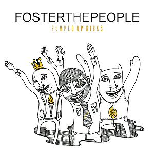
I came across an illustrated album cover for foster the peoples album and when I researched into it, it seems that the same illustrators (young & sick illustration) do a lot if not all of their art work I think the bold black line work works really well against the bright white background. The yellow pop of colour that a lot of their album art features also makes the image really visually interesting. This is not the style of illustration that i'd like to do for my album cover, but the central composition that they seem to use a lot is something that I would like to do with my album cover.
I think their more recent covers apply a bit more to my work as they use more colours and prettier imagery rather then simplistic line drawings they are more detailed and have a more interesting look to them.
I think their more recent covers apply a bit more to my work as they use more colours and prettier imagery rather then simplistic line drawings they are more detailed and have a more interesting look to them.
Subscribe to:
Post Comments (Atom)


No comments:
Post a Comment