I didn't like how this looked at all I just couldn't see how this would work on a book cover so I decided to forget this idea and try out another way of using a silhouette I tried out creating a digital one (I used my own head.) I think this actually looked okay but after I had created it I thought it looked familiar, then I remembered it was very, very similar to 'The Colour Purple' book cover and that book is the same genre as oranges are not the only fruit so I would definitely not be able to use this idea. Its okay though because I think that I can push this cover further and create something better anyway. Here I have inserted my designs and the design from 'The Colour Purple.'
Saturday, 3 January 2015
Oranges are not the only fruit experimentation
After drawing up my thumb nails I decided to have a play around with a few different ideas. I thought of creating a silhouette of someone so that it could be anyone that you want to imagine. I got the idea of carving it into an actual orange to see how it worked out. I tried it then photographed the orange with a few different lighting points to see how it looked.
I didn't like how this looked at all I just couldn't see how this would work on a book cover so I decided to forget this idea and try out another way of using a silhouette I tried out creating a digital one (I used my own head.) I think this actually looked okay but after I had created it I thought it looked familiar, then I remembered it was very, very similar to 'The Colour Purple' book cover and that book is the same genre as oranges are not the only fruit so I would definitely not be able to use this idea. Its okay though because I think that I can push this cover further and create something better anyway. Here I have inserted my designs and the design from 'The Colour Purple.'
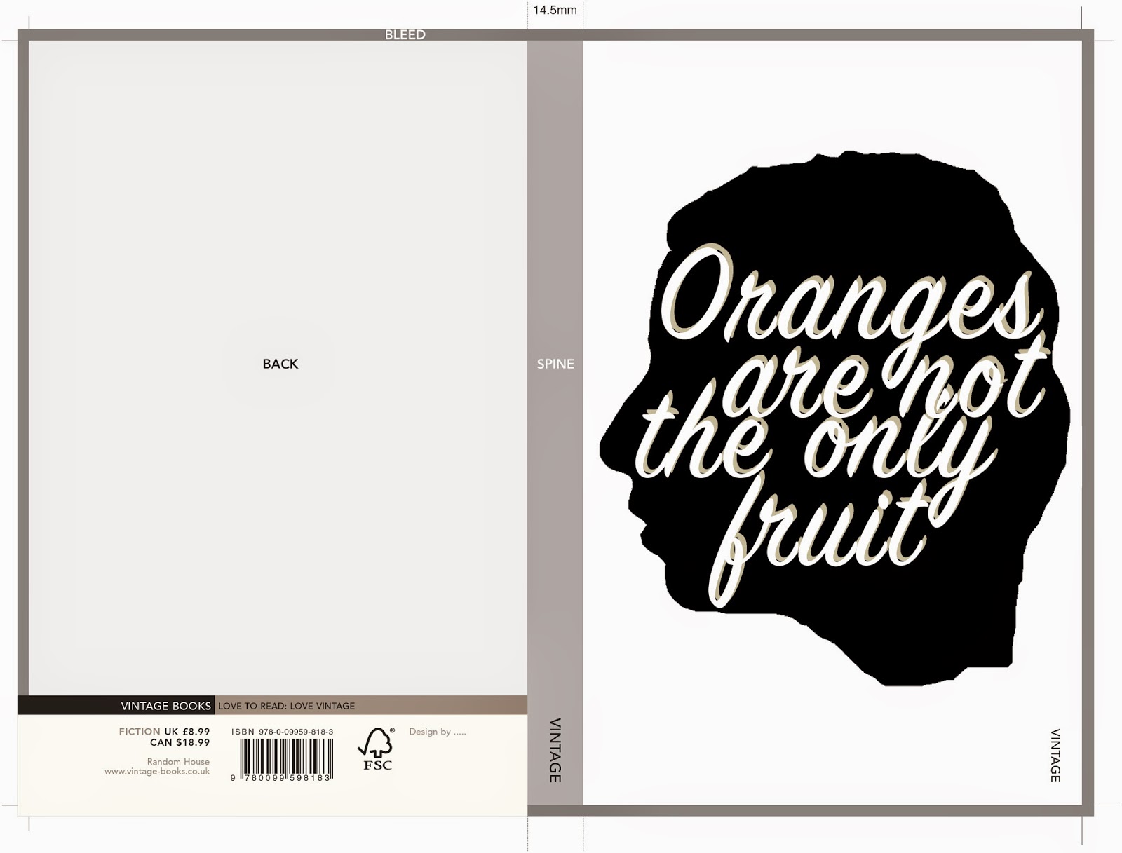
After this experiment I've decided to go back to my thumbnails and have a re think of what I can do. I think there are a lot more options that I can try out.
I didn't like how this looked at all I just couldn't see how this would work on a book cover so I decided to forget this idea and try out another way of using a silhouette I tried out creating a digital one (I used my own head.) I think this actually looked okay but after I had created it I thought it looked familiar, then I remembered it was very, very similar to 'The Colour Purple' book cover and that book is the same genre as oranges are not the only fruit so I would definitely not be able to use this idea. Its okay though because I think that I can push this cover further and create something better anyway. Here I have inserted my designs and the design from 'The Colour Purple.'
Oranges are not the only fruit- Thumbnails
As I was reading through Oranges are not the only fruit I started sketching down some thumb nails for the book cover, they are very rough so don't mind the terrible drawing they were just to give me a few ideas in terms of composition and what kind of imagery I wanted to include on the front. When reading the book I was finding it hard to just picture one image that would work for the story so I drew up lots of very different sketches, using different parts of the book for imagery, to see what ideas that I think worked best.
I decided from this that I liked the idea of using the top of the girls head and a thought bubble with the title of the book inside it. I liked this idea best because you cant see the characters full face, leaving some room for the readers imagination. I also thought this idea fit the way that the book is written well because its written from the girls internal monologue and her thoughts. I will now start to develop this idea further to see how it goes.
Sunday, 14 December 2014
Book cover inspiration? - Oranges are not the only fruit
Recently iv'e been looking for ideas and inspiration for the cover of 'Oranges are not the only fruit' because, although there is a lot of information and different themes in the book I wasn't getting many ideas or imagery for a cover design. I have been keeping an eye out and looking all over for some influences, here are a range of things that I have found around that have given me ideas. Hopefully this blog post will help me sort out the ideas that I have and help me to realise what ideas that I like the best.
I came across this pantone puzzle book whilst looking on the internet, I really liked how on the right hand page had a shape made out of block colour and a pattern shining through behind it. I thought this style would look great as a simplistic cover and it would also work well because I could take great inspiration from 1960's patterns as thats when the book is set. it would also be quite fitting if I used the shape of an orange for the cut out, as the book mentions oranges a lot, although the title suggests that it doesn't. I might try out a cover in this style after doing some thumbnails.
Another image that gave me a good idea is a book cover that already exists by Jamie Keenan, it uses a pretty rough pen drawing but the design is pulled together by a professional, clean, digital font. I really like the way the image is drawn on lined notebook paper as opposed to plain white. I think that something with a similar idea to this would work for 'Oranges are not the only fruit' as the mother in the story writes notes a lot. I think it would work to create a sort of doodle page but using themes from the book for doodles for example a cross, oranges, a bible ect.
The last thing that has really inspired me lately is a video for the song Anclebiters by Paramore. I spotted this video out of the corner of my eye because it looked so pretty. It was created by an artist/ illustrator/animator called Jordan Bruner. I really love the style and colours that are used, they are very eye catching. I think that a book cover with a similar vibe to this video would create a very modern twist on the book. this could be a good idea to look into as I feel this would attract a more modern audience to this classic book.
Tuesday, 9 December 2014
Using the laser cutter
As I had created all of my designs and cut them out by hand previously to practice, I discovered that it would take me a very long time to cut out everything that I needed by hand and I wouldn't be able to get it done in time to a very high professional standard. Because of this I decided to look into ways that I could fix this and decided that trying out a laser cutter would be my best option. I tracked down the laser cutter in uni and got some help from an experienced technician. He told me to make all of the shapes that I wanted cutting out in illustrator and told me the specifications to save all of the lines as. These are some of the the templates that I made for the laser cutter.
When I went to use the laser cutter, I tried out a different things for example I tried putting paper on top of my mount board to reduce the scorching that the laser leaves as it was not my original intention to have scorch marks. The paper technique didn't reduce the scorching much. But I decided after seeing the final cutting that I really liked the effect that the scorching gives as it adds much more character to the overall image and it will hopefully make the final image look slightly aged to fit in more with the time period that the book is set in. Here are a few of the pieces from the laser cutter they are not at all in the final composition, I just arranged them in a random order, I will upload better images of all of my laser cuttings on a different post.
Overall I found the laser cutter really helpful and although I was heavily assisted, it seemed quite simple to use. I would love to use this technique in the future as I really enjoyed the process and I can see good potential to make lots of different products with the aid of this technology.
Labels:
Carries war,
commercial,
laser cutter,
level 5,
penguin,
trees
Artist research: Andrea Dezsö
Whilst looking through the book Paper Craft 2 I came across an artist called Andrea Dezsö she is an artist that works across a huge range of media's. some of her paper cut work uses a similar idea to Hari and Deepeti in the way that the artist forms nicely lit silhouette scenes but instead of keeping the scene plain white, and relying on shadows to create the full effect, she uses coloured paper to add different moods and atmospheres to her images. I love the effect that this gives to her work and makes the worlds look so interesting, they really do draw you into them.
I think for my Carries war book cover I am going to stick with an all white scene for now to see how that looks, I might even experiment with different coloured lighting effects. but the coloured paper idea is definitely something to consider and try out, I might even utilise this idea for my oranges are not the only fruit book cover.
Thursday, 4 December 2014
Oranges are not the only fruit
For my second book cover design I have chosen to illustrate a cover for Oranges are not the only fruit because it is a fiction book and I feel like it will be easier for me to read that rather than freakanomics although that does sound interesting too. I feel as though I can get more information and symbolism from a fiction book because it has a fully developed story with lots of different characters and themes. As a starting point I thought I would have a look at previous book covers that have been designed for this book. My next step is to read the book and think about what id like to create for the cover it shouldn't take me to long to read so I can start on my concepts quite soon.
Im not to keen on the above cover, personally i'm not too fond of the illustrative style but there are a few other things that I don't think work that well. For example the border is very strange for a book cover because it just goes down one side of the image, and I feel although the text is slightly boring and harsh against the illustration that has barely any black in it.
I think the above cover is quite nice in the way that it gives a vintage classic a modern look. The quality of the drawing looks modern and the fact that the character has tattoo's really brings it into this day in age because when the book was set tattoo's would have been very taboo. The bright use of Orange against the washed out drawing gives the cover a really eye catching pop as well.
I do like the above cover but I think that compared to the one above it, it is not as strong of an image, I think this is because it is less focused compared to the other cover and I think the negative space at the top of the page makes the image look un balanced. I know that there is text there but I think if it was re arranged a bit it would work better.
In my opinion this is the strongest cover I think its because it is very unique compared to all of the other covers. I like the more simplistic look and the composition of the text and image, I think they work well together. I also really like the colours that have been used in this cover because I think that the orange bible really stands out against the blocky black.
Overall I have concluded that i like the more modern looking covers so I would like to go down the route of creating a more modern looking cover rather than a cover that represents the time period that the book was written in.
Im not to keen on the above cover, personally i'm not too fond of the illustrative style but there are a few other things that I don't think work that well. For example the border is very strange for a book cover because it just goes down one side of the image, and I feel although the text is slightly boring and harsh against the illustration that has barely any black in it.
I think the above cover is quite nice in the way that it gives a vintage classic a modern look. The quality of the drawing looks modern and the fact that the character has tattoo's really brings it into this day in age because when the book was set tattoo's would have been very taboo. The bright use of Orange against the washed out drawing gives the cover a really eye catching pop as well.
I do like the above cover but I think that compared to the one above it, it is not as strong of an image, I think this is because it is less focused compared to the other cover and I think the negative space at the top of the page makes the image look un balanced. I know that there is text there but I think if it was re arranged a bit it would work better.
Overall I have concluded that i like the more modern looking covers so I would like to go down the route of creating a more modern looking cover rather than a cover that represents the time period that the book was written in.
Tuesday, 2 December 2014
Thumbnails
I did some quick sketches of cover variations, they're not very detailed as they are just thumbnails but they give me an idea of how the compositions will look in my head. Drawing out my ideas also helped me realise what would work best where. I realised that I would have to think about the typography placement a lot so it helped me to visualise that as well.
I think I am going to work on and develop the first thumb nail as I think it is the most visually interesting. If that doesn't work out I have a few other designs that I can develop instead.
Subscribe to:
Posts (Atom)


