Saturday, 19 October 2013

Animals and creachers artist research: Albrecht Durer

Albrecht Durher is an artist that has created a wide variety of paintings throughout his career during the renaissance. Amongst these paintings there is a large veriety of animal pieces. His work is usually realistic and painted or drawn in a very classical way. Durher also created a lot of woodcuts that  were used as a stamp to print out images. 

Dead Bluebird - Albrecht Durer - www.albrecht-durer.org

Above is a painting by Durher entitled Dead Bluebird. The thing i like most about this painting is the deep blue colour used in the wings. I also love how soft and realistic the feathers look. 

'Rhinoceros' 1515 (woodcut print)

The image above is a wood cut print entitled: rhinoceros. I admire this image because of how complex it must have been to create. The tiny details in this print would have been so hard to cut into a piece of wood. i also love how it isn’t exactly realistic and it looks like the Rhino is wearing some kind of armour this makes the image a lot more interesting.


Thursday, 17 October 2013

Lino printing

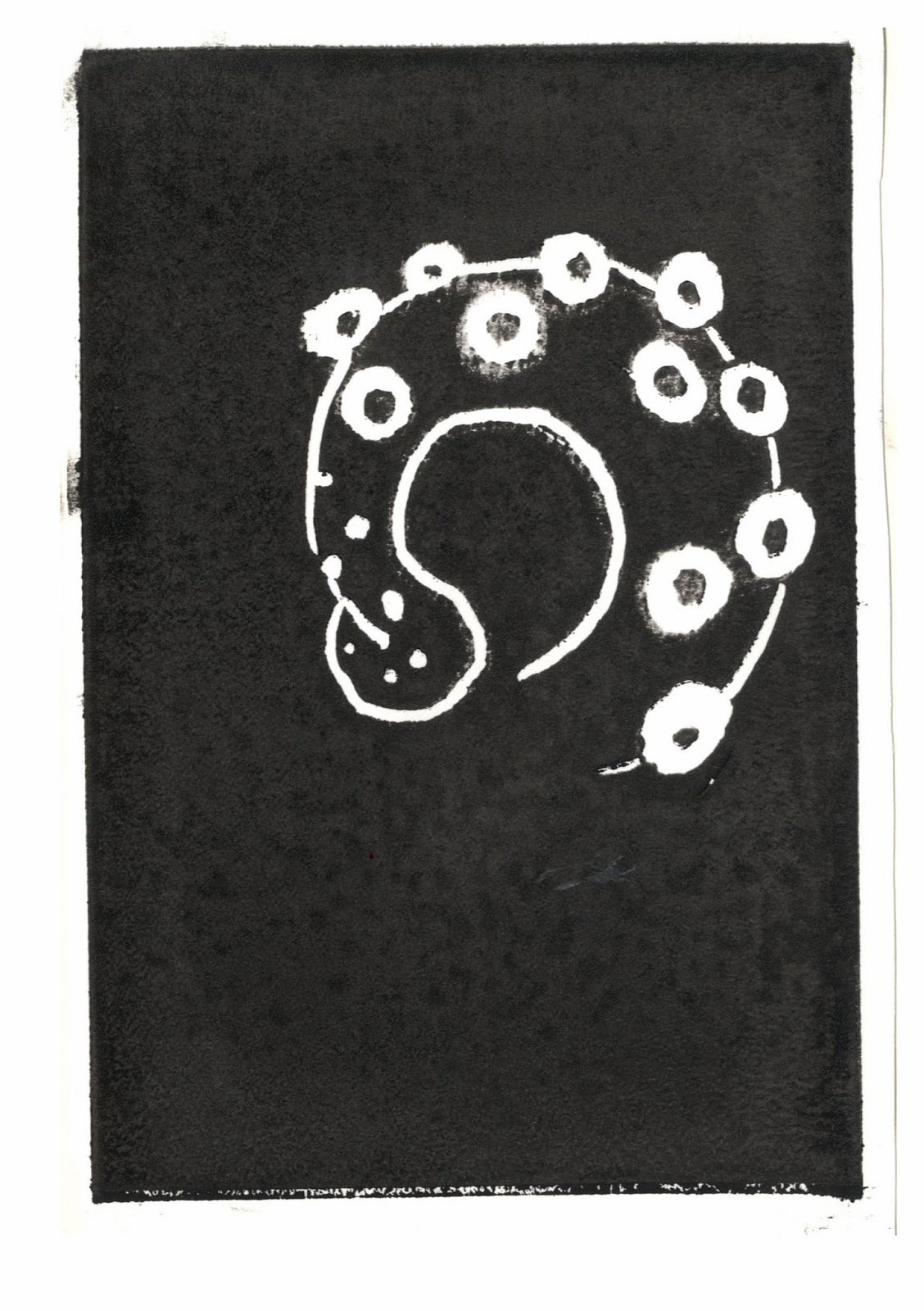
On tuesday i got an induction on how to use the printing press. I created some lino prints so i could learn how to use it properley. I have done lino cutting in the past so i knew that i would enjoy it. I decided to start off with a small test lino print to refresh my mind and see how it would work out. I decided to do an octopus tentacle because i thought the effect would work well for it. i enjoyed cutting it out although it was quite fiddly to do the little circles. In the end i really like how it turned out. The first print wasn't that good because i used a spoon to print the image so the print isn't that even. The second image was done on the printing press so it is much better.


I  decided that i really liked the look of this technique so i decided to see if i could incorporate it into some of my final images. I decided to do a whale head and a full set of octopus tentacles i was really happy with how they turned out. I decided to print out the whale heads in blue and black to see what i liked best. The prints are below. In the end i decided not to use these on my final images because it didnt look good with the other techniques that i was using.


Tuesday, 15 October 2013

Animals and creatures artist research: Nicholas Di Genova


Whilst searching for artists that combine animals i came across Nicholas Di Genova and fell in love with his distinct illustrations. De genova is an illustrator that creates animal hybrids using ink. I really like his unique style and I have chosen two of my favourite illustrations of his below.

I really like tne Iimage above because of the central composition of it, it just draws me in straight away. I also like the animals that he has combined I think they look really good together. The colours used bring the whole Image together Giving it an old feel as if it has been taken from 
an old nature illustration book.

My fafavourite thing about the image above is the great expression in the face of this creacher. It really brings the image to life And gives I
it a good sense of humour.

Monday, 14 October 2013

Animals and creatures artist research: Oliver Jeffers

Whilst doing artist research, I decided that I wanted to look into some artists that create more fun animal drawings with more character.  I started to think about children’s book illustrators as they often have that style.  
I then decided to look at some animal drawings from Oliver Jeffers children’s books because I really like them.


The first image I chose is a moose from the book 'this moose belongs to me.' I chose it because I love the warm colours that have been used, they give the image more of a nostalgic, vintage feel. I also like how little detail has been used it gives the moose more of a fun friendly look, I think I prefer that over a realistic look.


The second image I have chosen is a water colour of a whale for the book 'Stuck.' I chose this image because i like the simplicity of it. It is clear what the image is without lots of detail. I really like the water colour marks it has I think it fits really well as it gives the whale a more sea like look.


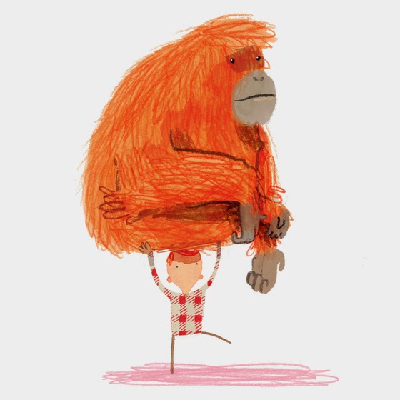
I last image that I wanted to include is an orangutan also from the book 'stuck.' I like the colours used in this image. I also like the scribbley crayon like lines, I think they give the drawing a great fun texture.

Animals and creatures artist research: Belin

I was searching for some animal artists and actually came across this guy 'Belin' by accident as he is usually a graphiti artist. He is based in Berlin but creates art all over the world. He does realistic art but it usually has a bit of a srange look to it because the colours he uses are so bright. He has only done a few animal pieces so far but I really like them.


I love the first image because of the two animals that he has decided to put together, I think it works really well.  I also like how realistic it looks for graphiti.


The second image that I looked at was a mixture of a wasp, rhino and lobster! A very strange combination indeed but it somehow works well. I think it works so well because of the limited colour pallete that has been used and thats why I like it so much. 


Thursday, 10 October 2013

Reportage artist research: Olivia Keith

Olivia Keith is a reportage artist that mainly works with charcoal and colour. I love how although her drawings often don't have much colour you still have a good feel of the atmosphere in the drawing.


the thing i like most about the image above is how much the wight gazebo stands out from everything else.

 This image is really interesting because it is so busy i love the harsh charcoal on top of the soft water colour background.


 I love the interesting background in this drawing. I also really like all of the layers of different colours.


Reportage artist research: George Butler

I looked at some of George Butlers reportage work to get an idea of different styles. I really liked the way he draws so loosely but it is still clear what the image is. i also love how chaotic his reportage drawings are.

I love the splashes of water colour in the image above i think it gives the scene a nice feel.
 I really like the above image as it is a typical life drawing class scene but the artist has focused more on the class drawing than on the life model. I like that because it shows a different way of looking at things.


i love the above image because of how the splats make up the dogs face and body.