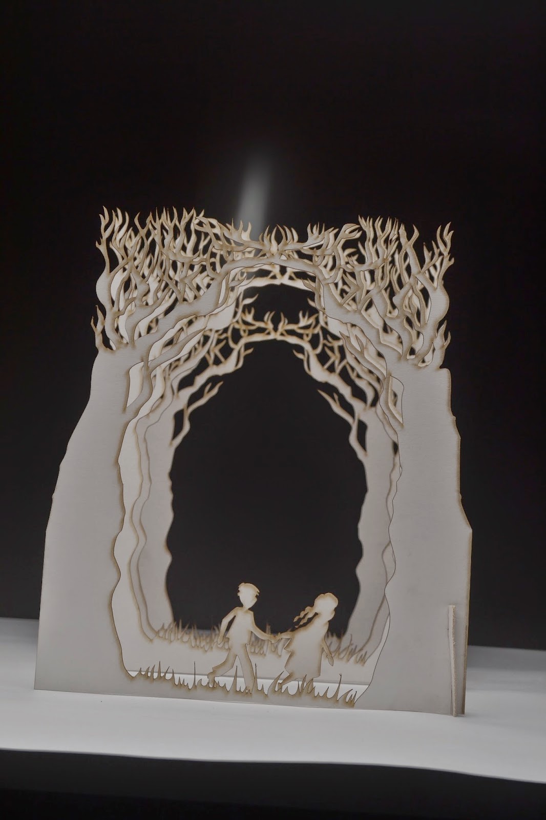
I started to photograph (with a lot of technical help) my book cover design for carrie's war as this is a vital part of my design. It was very tricky as the lighting has to be perfect to give the effect that I want for the cover. As I have layers of trees making the scene look like a forrest the lighting had to be played around a lot to make the image have lots of depth and shadows. I decided to start by photographing the image that will be on the back of the cover because it more simple than the front cover image and thought it might be good to start off with a more simple image. Here are a few of the photos that I started with (They're a bit wonky)
We started off lighting it from above and the left side but it made the image look too flat and everything was all the same orangey colour so we tried a few different lighting and camera settings.
This time the image still looked too flat but the colour had improved as it was more white rather than orange. I want the original image to look white so it will be easier if I want to change the colours in photoshop when I edit them.
This image was getting closer yet again but was not quite there because there was more variation and depth between the laters with the way that the shadows fell but it wasn't quite right.
We decided to try it with the light closer to the image and try holding up tracing paper behind the set to soften the light this was creating even more depth but it still wasn't there
we then decided to try with lighting the set with the soft box from behind and this seemed to be the correct solution because it started to look a lot better. There was also a dimly lit light in front of the set to light the front of the image slightly. Now it was just a case of getting the composition and camera angle right. Here are the photos with the correct lighting.
This is the first image where the depth was really working and the shadows were looking good but the camera angle needed to be moved around to make the image central.
The camera angle on this image is improved from the last one but not completely right yet so we got a bit closer and straightened up the edges more.
Finally after a long morning of experimentation and lots of different lights and techniques being used we got the image just right. The next step is to edit the levels and colours a bit in photoshop to help the image reach its full potential.
Friday, 9 January 2015
Wednesday, 7 January 2015
Oranges are not the only fruit Title typography
For this cover I wanted to use a hand written style for the title of the book, I decided this because im not that good at digital typography and knowing what looks good where and when I just write it myself things turn out looking a lot better. I also thought this would look a bit more unique and interesting compared to a standard digital font. I just began randomly scrawling the words from the title onto a piece of scrap paper. I then decided which style of lettering that I liked for which words. When I had decided on my favourites and the order that they should go in, I re drew them the way that I wanted them on the page. I then scanned them in so I could compose the cover digitally. The paper had a few shadows on when I had scanned it so I am going to scan in a new piece of paper and move the text onto the new paper background. I really like how it is looking so far, the next step is to add the illustration of the girl to the bottom of the page, the author name and any text has to go on the front.
Tuesday, 6 January 2015
Book cover research: Eleanor and Park
As for the 'Oranges are not the only fruit' I am creating a pretty contemporary cover for a story that is set in the 60's I felt that it was appropriate to reference the book 'Eleanor and Park' by Rainbow Rowell. It is a romantic novel that was written in 2013 but is set in 1986. I am aware that 1986 wasn't that long ago but the cover very much looks like this is a very contemporary story. Two book covers have been released for it and they are both very modern and don't reference the time period that the story is set in at all. Despite this the book has been incredibly successful. I think it is a really good thing sometimes for older books or books set in a different time period to have modern covers to open the book up to a new younger market that usually wouldn't consider even picking the book up. In my opinion If this book cover had been done in a style that referenced the time it was set in, I don't think it would have been half as successful. I know they say you shouldn't judge a book by its cover but its clear that people will and do, do that because it gives the first impression of whats inside. I really like both of these covers and although I haven't yet read the book these covers encourage me to, and I think I will when I have some spare time.
![]() |
| Eleanor and Park book cover, Image taken from: http://pixgood.com/eleanor-and-park-book-cover.html |
![]() |
| Emeanor and Park Book cover 2, Image taken from: http://pixgood.com/eleanor-and-park-book-cover.html |
artist research: Fran Meneses
I decided to have a look at Fran Meneses or better known as Frannerd for my research for my oranges are not the only fruit book cover. Fran is an illustrator that lives in Berlin she creates very cute little cartoon style drawings that often are based on real life things that happen day to day. She creates zines, cards, stickers and calendars along with a few other things on her etsy store and also makes youtube videos about her life as a free lance illustrator.
I received one of her zines for christmas as a gift and it really inspired me with this book cover because I was really stuck with what to do for it so I took a break for a while and sat down and read the zine. I really liked the scrap book feel to it and I also am a big fan of how the different hand drawn typography all works together on one page so well. I also think that the delicate line quality is really nice. Overall I just really like cuteness and the simplicity of her drawings. Here a few different drawings that I really like and a video from her youtube channel.
![]() |
| From the zine 'Perfect tree shapes' Photo taken from From: http://frannerdsblog.blogspot.co.uk/search?updated-max=2014-07- 01T12:29:00%2B02:00&max-results=10&start=10&by-date=false |
![]() |
| Image taken from: http://frannerdsblog.blogspot.co.uk/search?updated-max=2014-07-01T12:29:00%2B02:00&max-results=10&start=10&by-date=false |
![]() |
| Image taken from: https://www.dropbox.com/s/s899uf5c88jfsqd/Screenshot%202015-01-06%2011.21.22.png?dl=0 |
Labels:
artist research,
book cover,
commercial,
etsy,
Frannerd,
level 5,
penguin,
research,
youtube
Sunday, 4 January 2015
Artist research Gemma Topliss
I was looking for illustrators that have a really simplistic look because for my oranges are not the only fruit cover I want it to be quite simple but effective. I came across this illustrator called Gemma Topliss from Australia, I really love the line quality of her drawings as it is very delicate and this adds a really unique feel to them. Her drawings take you to a whimsical but also quite creepy world and i like that her drawings have the ability to do that. I also really like when simple hand drawn typography is added to the drawings as this adds an extra element of interest to the image. I think that for this book cover I would like to include some line drawing as that is one thing that I enjoy doing but haven't done much of lately.
![]() |
| Gemma Topliss Image from: http://www.parallelplanets.com/2014/03/gemma-topliss-dream-little-dream-for-me.html |
![]() |
| Gemma Topliss Image from: http://gemmatopliss.blogspot.co.uk/2013/10/new-sketchbook.html |
![]() |
| Gemma Topliss image from: https://www.tumblr.com/search/gemma+topliss |
Saturday, 3 January 2015
Oranges are not the only fruit experimentation
After drawing up my thumb nails I decided to have a play around with a few different ideas. I thought of creating a silhouette of someone so that it could be anyone that you want to imagine. I got the idea of carving it into an actual orange to see how it worked out. I tried it then photographed the orange with a few different lighting points to see how it looked.
I didn't like how this looked at all I just couldn't see how this would work on a book cover so I decided to forget this idea and try out another way of using a silhouette I tried out creating a digital one (I used my own head.) I think this actually looked okay but after I had created it I thought it looked familiar, then I remembered it was very, very similar to 'The Colour Purple' book cover and that book is the same genre as oranges are not the only fruit so I would definitely not be able to use this idea. Its okay though because I think that I can push this cover further and create something better anyway. Here I have inserted my designs and the design from 'The Colour Purple.'
After this experiment I've decided to go back to my thumbnails and have a re think of what I can do. I think there are a lot more options that I can try out.
I didn't like how this looked at all I just couldn't see how this would work on a book cover so I decided to forget this idea and try out another way of using a silhouette I tried out creating a digital one (I used my own head.) I think this actually looked okay but after I had created it I thought it looked familiar, then I remembered it was very, very similar to 'The Colour Purple' book cover and that book is the same genre as oranges are not the only fruit so I would definitely not be able to use this idea. Its okay though because I think that I can push this cover further and create something better anyway. Here I have inserted my designs and the design from 'The Colour Purple.'
Oranges are not the only fruit- Thumbnails
As I was reading through Oranges are not the only fruit I started sketching down some thumb nails for the book cover, they are very rough so don't mind the terrible drawing they were just to give me a few ideas in terms of composition and what kind of imagery I wanted to include on the front. When reading the book I was finding it hard to just picture one image that would work for the story so I drew up lots of very different sketches, using different parts of the book for imagery, to see what ideas that I think worked best.
I decided from this that I liked the idea of using the top of the girls head and a thought bubble with the title of the book inside it. I liked this idea best because you cant see the characters full face, leaving some room for the readers imagination. I also thought this idea fit the way that the book is written well because its written from the girls internal monologue and her thoughts. I will now start to develop this idea further to see how it goes.
Subscribe to:
Posts (Atom)


