Friday, 30 January 2015

Frida Kahlo research

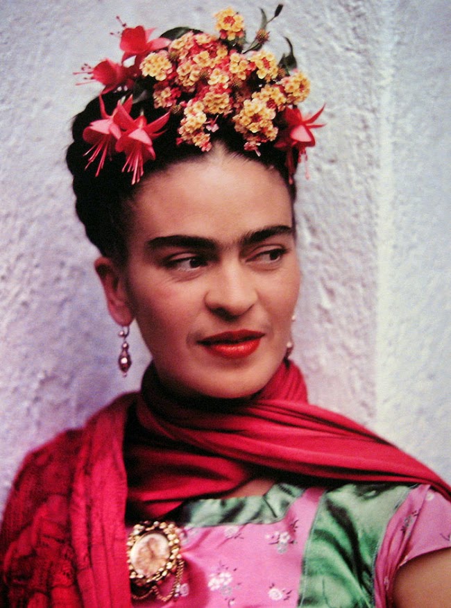
For my First female artist I decided to look into Frida Kahlo as she is one of the only female artists that most people will know. She has had a very interesting life so I thought that there would be lots of impressive information and facts about her that younger people would be inspired by. I watched a full length documentary to get a full timeline of her life and to make sure that the facts I had were correct. Here are some of the facts that I found interesting. I have also included a photograph of Kahlo and a self portrait that she created. 

Full Name: Magdalena Carmen Frieda Kahlo y Calderón
Born: July 6, 1907,  Coyoacán Mexico 
Died: July 13, 1954 (age 47)
Movement: Magic realism, Surrealism, Modern art


  • At the age of 6 Frida got polio, resulting in one of her legs being thinner than the other.
  • When she was young Frida wanted to break the stereotype of being a girl so she would dress like a boy and play boys sports such as wrestling and boxing.
  • At 19 years old Kahlo was in a serious bus accident, the bus collided with a street car. As a result of this collision Kahlo was impaled by a metal hand rail, it went into one side of her hip all the way through and came out the other side. She also suffered many other injuries including fractures in her spine and a crushed foot.
  • After the accident she spent a lot of time in a body cast and she was bed ridden. She would paint to occupy her time. 
  • She has a trademark unibrow that gave her a very distinctive look. She painted it in all of her self portraits.
  • When Kahlo grew up she wore lots of Jewellery covered in bright bold jewels, and big flamboyant flowers in her hair. She had a very individual look that made her very interesting to look at.
  • The house she was born in was called the 'Blue house.'
  • She married fellow artist Diego Rivera in 1940. They stayed together but had a vary turbulent relationship. He had an affair with her sister and other women, Kahlo also had a few affairs.
  • When Kahlo was 37 her health started to deteriorate and her back became very weak she wore many plaster braces that she would paint and decorate with bright patterns and shapes. 
  • At 47 Kahlo passed away as a result of her ill health in the 'Blue house' that she was born in.


Thursday, 29 January 2015

Vincent Van Gogh Research

As the book I aim to create will have information and facts about artists I decided to find out some interesting things about Vincent Van Gogh. I started with finding out the basic information such as when he was born and died and his artistic movement. I then went into finding more interesting focused facts about him. Here is the information that I have found so far, I may add more facts or replace some if there aren't enough or I find better ones in the future. I also included a self portrait of Van Gogh

Born: 30 March 1853, in the Netherlands
Died: 29 July 1890, (aged 37)
Movement: Post-impressionism  

  • Van Gogh wrote over 800 letters in his lifetime, most of these letters were written to his brother Theo, who was also his best friend.
  • In his short life he created the astonishing amount of 2000 pieces, this is including drawings and sketches as well as paintings. 
  • Van Gogh only became famous after his death because his brothers wife set out to get him the recognition that he deserved. 
  • Within 10 years Van Gogh created approximately 900 paintings! some of which are known as the greatest works of art ever created.
  • Van Gogh committed suicide by shooting himself and dying of blood loss two days later.  
  • He suffered greatly from mental illness and spent part of his life in the Saint-Paul Asylum. This is where the famous painting 'starry night' was created, it is thought to be of the view from his room. 
  • Part of Van Gogh's ear lobe was cut off, no one knows the real truth about how this event took place there are a few different stories as to how this happened. Many people think that he cut it off himself but there are other theories that his artist friend Paul Gauguin cut it off in a row.
  • Van Gogh painted 30 self portraits between 1886 and 1889.
Self portrait of Vincent Van Gogh


Artists to consider for the book

As I wanted to include a collection of both male and female artists within this book I decided to compose a list of both male and female artists to consider including in the book. I found this quite difficult because there were a lot more male artists as in the past the artistic industry was very prejudice towards women and as a rule females were not artists, there are a few exceptions and women will have created art they just were not given the credit or recognition that they deserved. Despite this I have managed to find an equal amount of artists from both genders. After researching the artists separately I may revise the list and add or take away some of the people on it but this is what I have for now, as a starting point. I have done the lists as two separate ones so I know how many of each gender that I have. I aim to keep it as equal as possible (the lists are in no particular order, I just wrote them down in the order that I thought of them)

Males

  • Salvador Dali
  • Vincent Van Gogh
  • Pablo Picasso
  • Leonardo Da Vinci 
  • Henri Matisse 
  • Andy Warhol 
  • Johannes Vermeer
  • Michelangelo Buonarroti 
Females 
  •  Frida Kahlo
  • Georgia O' keeffe
  • Artemisia Gentileschi
  • Lavinia Fontana 
  • Rosa Bonheur 
  • Paula Rego 
  • Giulia Lama 
  • Hilma Af Klint 

Monday, 26 January 2015

Negotiated Module

Because the new project is negotiated, I can decide on whatever I want to do for this module. When I first thought about this brief it was pretty overwhelming as I could literally choose to create anything that I wanted as long as it could have some sort of commercial application. First of all I thought it would be good to create some sort of zine along with a few other illustrated products that could be sold online in a store such as Etsy, as lot of illustrators that I like do this and it seemed like a fun sort of project to do. I decided against this though because after a little chat with my tutor Amy I realised that I could use this opportunity to create something that could potentially lead to better opportunities for myself. She suggested creating a children's book because I love children's books and how beautiful that they can be. I agreed that this would be a good idea so I am planning on going down the route of creating some sort of book that would be suited to a younger audience.

As I like to come up with stories but am not too confident on wording a story correctly for a children's story/picture book I have decided to go down the route of creating factual, educational book about historical artists. I felt as though this was a good route to go down because I have been thinking about considering a career in education lately and this ties in with that as well. I think it will make the book really fun and quirky if I add strange and creepy facts about the artists, a bit like horrible history books. I have decided that this will appeal to children from the ages of about 10 all the way up to whatever age really, anyone who is interested in artists and interesting facts are  likely to be drawn to the book. I also plan to create the book using tasteful but interesting illustrations and colour palettes so that adults and children alike will be drawn to the book.

I will now start to research which artists I will include in the book, I want to attempt to have an equal amount of female to male artists although this may be challenging as in the past women weren't seen as equally as men within art and even if they did create something they often weren't credited for it. I also need to think of a title for the book but i feel like that will come with time and ill think of it whilst i am creating the images. I will also look at influences to help me decide on how I would like the book to look.

Monday, 12 January 2015

oranges are not the only fruit concept

The concept for this book cover was to bring an older story into the modern age attracting a younger audience to the book. I wanted to create a clean modern look whilst not referencing directly that it was a particularly modern story. I also wanted to get across the girls feelings of sadness so the audience will know the overall tone of the book. I wanted to portray idea of thoughts and writing down notes as this is referenced a lot throughout the book. I feel that the angle that I have decided to go with for the concept is quite risky because it doesn't focus directly on the story but more the main character and the feelings that she has. 

Carries war book cover concept

The overriding concept of this book cover was to focus on a part of the story where the two main characters go to visit their friend’s house. They go quite regularly so I thought that this would help children to picture that part of the story in their heads, It is also the part of the story that I found most interesting, it was very descriptive and gave me this wonderful magical but also creepy scene in my head. I wanted to create this scene in real life then photograph it in the hope that it would draw children into the scene, making them want to read the story themselves. I also thought I would make the scene have a slight orange glow to crate a warm feeling of nostalgia which would also draw adults into the book to buy it for their children. I feel although my concept brings an added element into this story helping children to expend their imagination and in turn be more interested in the story.


Module evaluation part 2: Oranges are not the only fruit

Alongside creating the carries war book cover I began to read and develop ideas for the book Oranges are not the only fruit. When I was reading this book not one single image stood out to me that would work well on a book cover because there were so many topics and themes covered in the book. The main themes are religion and lesbian love but alongside this there are a lot of stories and bible verses. Because no images came into my mind I started to sketch lots of different thumbnails out to see what came from it. This proved very beneficial as it helped me to decide what I liked the look of most. 

I started off by creating a silhouette style image using my own profile for the girl head. I then added the title of the book within the silhouette, I think the design was okay but nothing really special. After completing this cover I realised that this cover idea was very similar to the cover for ' The colour Purple,' another lesbian love story, I would not be able to use something so similar to something that already existed. I am glad this happened because it allowed me to think more and expend my ideas and designs.  I went back to my thumbnails and had a look through the other ideas that I had, I saw a sketch of a girl at the bottom of the page and the title above her head as if it was her thoughts. I really liked this idea but my next decision was to choose the style that I wanted to create the book cover in. At this point, I don't really know why but the Eleanor and Park book cover popped into my head and it gave me the idea to create a really modern book cover for a quite old dated story, a similar thing to what the Eleanor and Park book cover did. I thought that tis idea would attract a new more young audience to the book, a market that usually wouldn't even think to pick this book up. I thought it would be a good idea to refresh the book and bring it into this age. 

I then started on designs. As the brief specified a strong use of typography I decided to make this the focal point of the book I wanted to create a really nice quirky hand written title for the book. I’m not too great with digital fonts so I thought I would do what I know and just draw the letters. I kept it in quite a loose style so it looks as if someone could have doodled it down onto paper because there are a lot of notes that get written throughout the book and I feel as though this fits with the story. I also decided to have the books background as lined paper so it really looked like a note.  I am pleased with how the text turned out considering I don't think I'm that good at typography. I then drew the design for the girl at the bottom of the page, I wanted her to look sad because throughout the book that seems to be the feeling that she feels the most. I decided on a simple line drawing to keep the design clean, simple and modern. After scanning it in and putting it on Photoshop I decided to colour the hair and eyebrows with a light orange to reference to the title and the oranges from the story.  

I then added all of the digital text such as the author name and quote. I put the authors name in a band the same colour as the girl’s hair, I think this contained the name nicely and brought the image together and balanced it out so it was no longer bottom heavy. I continued the orange band onto the spine and the back page. I think this makes the back and front of the book work together as a cohesive piece. I decided to use my hand writing for the blurb so that again it looked like a note that someone had written. I think that it balanced out the use of digital and hand written text nicely making it look professional as opposed to a hand made DIY book cover. After adding all of the text to the back cover  I decided that it did feel a bit plain and it needed something extra. I decided to then add some doodle style motifs referencing themes in the book, I decided to keep them in the orange accent colour that I used throughout the design. 

Overall I am really pleased with how this book cover turned out because I think it looks really modern and quirky and I would probably pick it up if I saw it on a bookshelf. I also really like the illustration style, I would like to play around with this style a lot more in the future. I feel as though it is a real risk for me to enter this as a cover as it is so modern for a story set in the 60's but who knows it could really work as a re brand of the story and bring it into the modern day. I think that a cover like this would really attract a new audience to the book. If I was to re do this project I think that I would maybe spend a little bit more time making sure everything is tidied up and polished to an even higher standard But I am quite pleased with how professionally it has came out compared to previous projects. Personally I really think that I am improving with creating a more professional finish compared to last year, I think that I can keep up with this and be even more meticulous to create projects with the an even higher standard in the future.